/* ==========================================================================
   MAGIK: the site's one stylesheet for every page (the homepage hero adds
   css/hero.css). Direction A, House Lights, grown out of the live hero.

   Read docs/redesign/DESIGN-SYSTEM.md first: it says what each piece is FOR.
   This file is organised the same way:

     1  Typefaces (self-hosted; the CSP allows fonts from our origin only)
     2  Tokens: the master brand and the three worlds
     3  World scopes: .w-master .w-ink .w-creative .w-velvet .w-tech
        .w-console .w-pathways .w-earth .w-laterite
     4  Base, focus, skip link
     5  Layout: edges and rhythm
     6  Type roles: billing, voice, reading, credits, instrument
     7  Header, desktop nav, phone menu
     8  Page heads
     9  Buttons and links (hover never moves a button)
    10  Pieces by role: frame, screen, tiles, chapter, step, statement,
        chip, photo, note
    11  Film: the inline player and the film dialog
    12  Forms
    13  Footer
    14  Reveal (visible at rest) and reduced motion
    15  Where next: the next-world band before the footer
    16  Division components: the one vocabulary every page builder uses
        (division accents, hero, visual, section head, cards, field and
        window, callouts, rows, folds, switcher, journey, close)

   Cache: served with a one-year immutable cache, so every page links it as
   /css/magik.css?v=N. Change the file, bump N on every page.
   ========================================================================== */


/* 1  TYPEFACES -------------------------------------------------------------
   Archivo (reading, weights 400 to 800) and Archivo Display (the same
   family with its width axis kept: billing, and the voice turn inside a
   title, at 90% width and weight 900, as the hero's headline is set). Both
   SIL OFL, both from /fonts/. These two files are the whole set; no other
   face is loaded, and nothing on the site is italic (Daniela, 27 September:
   the serif voice is retired). The instrument role (timecode, console
   figures) is Archivo with tabular figures and a little tracking. */
@font-face{
  font-family:'Archivo';
  font-style:normal;
  font-weight:400 800;
  font-display:swap;
  src:url('../fonts/archivo-variable.woff2') format('woff2-variations'),
      url('../fonts/archivo-variable.woff2') format('woff2');
}
@font-face{
  font-family:'Archivo Display';
  font-style:normal;
  font-weight:100 900;
  font-stretch:62% 125%;
  font-display:swap;
  src:url('../fonts/archivo-wdth-variable.woff2') format('woff2-variations'),
      url('../fonts/archivo-wdth-variable.woff2') format('woff2');
}


/* 2  TOKENS ----------------------------------------------------------------
   Values only. Components never use these directly for ground and text:
   they use the role variables a world scope sets (section 3), so the same
   component reads correctly in every room. */
:root{
  /* MAGIK master. Red is a signal, never a field. */
  --m-red:#E31B23;          /* square full stop, cue dot, the one primary action, the Contact arrow */
  --m-red-hover:#C8141B;    /* primary button on hover (label 5.8:1) */
  --m-red-press:#B8141B;    /* primary button pressed; small red text on #FFFCFC (6.5:1) */
  --m-red-lift:#F0444A;     /* small red text on ink (5.4:1) */
  --m-ink:#0A0506;          /* house ink: the hero, the auditorium, the footer */
  --m-paper:#FFFCFC;        /* screen light: the site ground. Never cream, never beige. */
  --m-lede-dark:#E9E4E4;    /* reading text on ink (16.1:1) */
  --m-grey-dark:#CCC4C5;    /* credits on ink (11.8:1) */
  --m-grey-light:#6E6566;   /* credits on #FFFCFC (5.5:1) */

  /* Creative, the auditorium: red + ink + rich cinematic tones */
  --c-velvet:#3E0E13;       /* chapter fields */
  --c-tungsten:#E8A94B;     /* light spill, rules, timecode; never a fill (9.8:1 on ink) */
  --c-soil:#F36C3C;         /* the film's own colours, only as spill around a playing frame */
  --c-leaf:#71BE26;
  --c-sky:#AED4FC;

  /* Tech, the booth: red + graphite + cool digital neutrals */
  --t-room:#222A32;         /* the room */
  --t-console:#2B333C;      /* interface surfaces */
  --t-hairline:#3D4650;     /* panel rules (decorative) */
  --t-occupied:#56626F;     /* filled states */
  --t-steel:#8AA5BC;        /* outlines, settled states (5.0:1 on console) */
  --t-cool:#A9B4BF;         /* secondary type (6.1:1 on console) */
  --t-phosphor:#EAF1F5;     /* primary type (11.2:1 on console) */
  --t-red-text:#FF7378;     /* type that needs a person (4.9:1 on console) */
  --t-red-shape:#F0444A;    /* shapes that need a person, 2px and up (3.4:1) */

  /* Pathways, the doors to daylight: red + warm earth and field */
  --p-laterite:#B4532A;     /* the path, bands, accents; text-safe (4.9:1) */
  --p-earth:#2B1D15;        /* type, the guardian (16.0:1) */
  --p-olive:#5B6B35;        /* labels, the coach (5.7:1) */
  --p-ochre:#C8962E;        /* lines and fills only, never type on #FFFCFC (2.6:1) */
  --p-sand:#EFE3D8;         /* type on earth (12.9:1) */
  --p-dust:#C9B8AA;         /* captions on earth (8.5:1) */

  /* Type families */
  --m-sans:'Archivo', 'Helvetica Neue', Helvetica, Arial, sans-serif;
  --m-display:'Archivo Display', 'Archivo', 'Helvetica Neue', Helvetica, Arial, sans-serif;
  /* the instrument role: Archivo, always with tabular figures, so digits
     line up in columns and a running clock never shifts; tracked a little */
  --m-instrument:'Archivo', 'Helvetica Neue', Helvetica, Arial, sans-serif;
  --m-instrument-track:.02em;

  /* Billing sizes: display only, never under 40px */
  --m-bill-xl:clamp(56px, 8.334vw, 120px);   /* the hero, world titles */
  --m-bill-l:clamp(48px, 7.2vw, 104px);      /* the film title, big chapter moments */
  --m-bill-m:clamp(44px, 4.2vw, 60px);       /* Pathways stages */
  --m-bill-s:clamp(40px, 3.3vw, 56px);       /* programme chapters, the smallest billing (48px at 1440, so 3D VISUALISATION keeps to its column) */

  /* Edges: one left and one right edge, the hero's own. 96px at 1440; past
     1920 the column stops growing and centres. */
  --m-g:clamp(56px, 6.667vw, 128px);
  --m-pad:max(var(--m-g), calc((100% - 1664px) / 2));
  --m-header-h:80px;

  /* Rhythm: scenes, not boxes. Whitespace separates; rules are rare. */
  --m-space-scene:clamp(88px, 10vw, 152px);  /* between scenes (sections) */
  --m-space-block:clamp(48px, 5.6vw, 80px);  /* between blocks in a scene */
  --m-space-group:clamp(24px, 2.8vw, 40px);  /* between items in a group */

  /* Division accents (section 16). The master brand's is red; a division
     class (.dv-creative, .dv-tech, .dv-pathways) on <body> or on a section
     swaps all three. --dv-accent is for fills and lines; the -dark and
     -light values are the text-safe versions on ink and on #FFFCFC. */
  --dv-accent:#E31B23; --dv-accent-dark:#F0444A; --dv-accent-light:#B8141B; --dv-accent-ink:#FFFCFC;
  --dv-dark:0;

  /* Motion: dim, project, cut */
  --m-dimmer:cubic-bezier(.2,.7,.2,1);       /* a change of light level, 400 to 900ms */
  --m-arrive:cubic-bezier(.2,.8,.2,1);       /* things that arrive */
  --m-light:600ms;                           /* the usual light change */
  --m-daylight:700ms;                        /* the doors to daylight, the one slow change */
}
@media (max-width:899px){
  :root{ --m-g:clamp(20px, 5.13vw, 44px); --m-header-h:60px; }
}


/* 3  WORLD SCOPES ----------------------------------------------------------
   Put one on <body> for the page's room, and on any section that changes
   room. Each paints its ground and sets the role variables every component
   reads:
     --m-ground  --m-text  --m-text-2 (ledes, body on dark)  --m-muted (credits)
     --m-rule (quiet dividers)  --m-line (outlines that carry meaning, 3:1+)
     --m-voice (the turn of a line)  --m-accent (rules, timecode)
     --m-red-text (small red type)  --m-error  --m-fill-hover  --m-fill-press
   The header does not follow the scope: it follows its own data-tone. */
.w-master, .w-light{
  --m-ground:var(--m-paper); --m-text:var(--m-ink); --m-text-2:#2A2425; --m-muted:var(--m-grey-light);
  --m-rule:rgba(10,5,6,.14); --m-line:rgba(10,5,6,.5); --m-voice:var(--m-ink); --m-accent:var(--m-grey-light);
  --m-red-text:var(--m-red-press); --m-error:var(--m-red-press);
  --m-fill-hover:rgba(10,5,6,.08); --m-fill-press:rgba(10,5,6,.16);
}
.w-ink, .w-creative{
  --m-ground:var(--m-ink); --m-text:var(--m-paper); --m-text-2:var(--m-lede-dark); --m-muted:var(--m-grey-dark);
  --m-rule:rgba(255,252,252,.16); --m-line:rgba(255,252,252,.5); --m-voice:var(--m-paper); --m-accent:var(--m-grey-dark);
  --m-red-text:var(--m-red-lift); --m-error:#FF7378;
  --m-fill-hover:rgba(255,252,252,.08); --m-fill-press:rgba(255,252,252,.16);
}
.w-creative{ --m-accent:var(--c-tungsten); }
.w-velvet{
  --m-ground:var(--c-velvet); --m-text:var(--m-paper); --m-text-2:var(--m-lede-dark); --m-muted:var(--m-grey-dark);
  --m-rule:rgba(255,252,252,.16); --m-line:rgba(255,252,252,.5); --m-voice:var(--m-paper); --m-accent:var(--c-tungsten);
  --m-red-text:#FF7378; --m-error:#FF8A8E;
  --m-fill-hover:rgba(255,252,252,.08); --m-fill-press:rgba(255,252,252,.16);
}
.w-tech, .w-console{
  --m-ground:var(--t-room); --m-text:var(--t-phosphor); --m-text-2:var(--t-cool); --m-muted:var(--t-cool);
  --m-rule:var(--t-hairline); --m-line:var(--t-steel); --m-voice:var(--t-phosphor); --m-accent:var(--t-steel);
  --m-red-text:var(--t-red-text); --m-error:var(--t-red-text);
  --m-fill-hover:rgba(234,241,245,.08); --m-fill-press:rgba(234,241,245,.16);
}
.w-console{ --m-ground:var(--t-console); }
.w-pathways{
  --m-ground:var(--m-paper); --m-text:var(--p-earth); --m-text-2:var(--p-earth); --m-muted:var(--p-olive);
  --m-rule:rgba(43,29,21,.16); --m-line:rgba(43,29,21,.6); --m-voice:var(--p-laterite); --m-accent:var(--p-olive);
  --m-red-text:var(--m-red-press); --m-error:var(--m-red-press);
  --m-fill-hover:rgba(43,29,21,.08); --m-fill-press:rgba(43,29,21,.16);
}
.w-earth{
  --m-ground:var(--p-earth); --m-text:var(--m-paper); --m-text-2:var(--p-sand); --m-muted:var(--p-dust);
  --m-rule:rgba(255,252,252,.16); --m-line:rgba(255,252,252,.5); --m-voice:var(--p-sand); --m-accent:var(--p-dust);
  --m-red-text:#FF8A8E; --m-error:#FF8A8E;
  --m-fill-hover:rgba(255,252,252,.08); --m-fill-press:rgba(255,252,252,.16);
}
.w-laterite{
  --m-ground:var(--p-laterite); --m-text:var(--m-paper); --m-text-2:var(--m-paper); --m-muted:var(--m-paper);
  --m-rule:rgba(255,252,252,.3); --m-line:rgba(255,252,252,.7); --m-voice:var(--m-paper); --m-accent:var(--m-paper);
  --m-red-text:var(--m-paper); --m-error:var(--m-paper);
  --m-fill-hover:rgba(255,252,252,.1); --m-fill-press:rgba(255,252,252,.2);
}
.w-master, .w-light, .w-ink, .w-creative, .w-velvet, .w-tech, .w-console,
.w-pathways, .w-earth, .w-laterite{ background-color:var(--m-ground); color:var(--m-text); }
/* --dv-dark tells the division components (section 16) which way the
   ground under them goes: 1 on a dark ground, 0 on #FFFCFC. Every dark
   scope and dark component sets it, so a small accent label picks its
   text-safe colour by itself. */
.w-master, .w-light, .w-pathways{ --dv-dark:0; }
.w-ink, .w-creative, .w-velvet, .w-tech, .w-console, .w-earth, .w-laterite{ --dv-dark:1; }


/* 4  BASE ------------------------------------------------------------------ */
*, *::before, *::after{ box-sizing:border-box; }
*{ margin:0; padding:0; }
html{ scroll-behavior:smooth; -webkit-text-size-adjust:100%; text-size-adjust:100%; }
body{
  /* the master room unless the page names another */
  --m-ground:var(--m-paper); --m-text:var(--m-ink); --m-text-2:#2A2425; --m-muted:var(--m-grey-light);
  --m-rule:rgba(10,5,6,.14); --m-line:rgba(10,5,6,.5); --m-voice:var(--m-ink); --m-accent:var(--m-grey-light);
  --m-red-text:var(--m-red-press); --m-error:var(--m-red-press);
  --m-fill-hover:rgba(10,5,6,.08); --m-fill-press:rgba(10,5,6,.16);
  background-color:var(--m-ground); color:var(--m-text);
  font-family:var(--m-sans); font-size:17px; line-height:1.6; font-weight:400;
  -webkit-font-smoothing:antialiased; -moz-osx-font-smoothing:grayscale;
}
img, video, svg{ display:block; max-width:100%; }
img, video{ height:auto; }
a{ color:inherit; text-decoration:none; }
button, input, select, textarea{ font:inherit; color:inherit; letter-spacing:inherit; }
button{ cursor:pointer; background:none; border:0; }
ul[role="list"], ol[role="list"], .m-list-plain{ list-style:none; }
h1, h2, h3, h4{ font-weight:600; line-height:1.15; }
/* Red selection reads on the paper pages and on the dark bands alike. */
::selection{ background:var(--m-red); color:#FFFCFC; }
/* [hidden] must win over any component's display rule */
[hidden]{ display:none !important; }

/* Focus: one ring for every ground. A 2px ink line inside a 6px #FFFCFC
   halo reads on ink, graphite, earth, laterite, red and daylight alike. */
:focus-visible{ outline:2px solid var(--m-ink); outline-offset:2px; box-shadow:0 0 0 6px var(--m-paper); }
:focus:not(:focus-visible){ outline:none; }

.m-skip{
  position:fixed; top:8px; left:8px; z-index:4000;
  display:inline-flex; align-items:center; min-height:44px; padding:0 18px;
  background:var(--m-ink); color:var(--m-paper);
  font-size:14px; font-weight:600;
  transform:translateY(-160%); transition:transform .2s var(--m-dimmer);
}
.m-skip:focus{ transform:none; }
/* visually hidden, still read */
.m-sr{ position:absolute !important; width:1px; height:1px; margin:-1px; overflow:hidden; clip:rect(0 0 0 0); clip-path:inset(50%); white-space:nowrap; }
html.m-locked{ overflow:hidden; }


/* 5  LAYOUT ----------------------------------------------------------------
   .m-main clears the fixed header (except under a hero that runs beneath
   it). .m-wrap sets the one left and one right edge. .m-section is a scene. */
.m-main{ display:block; padding-top:var(--m-header-h); min-height:50vh; }
.m-header--over ~ .m-main{ padding-top:0; }
.m-wrap{ width:100%; padding-left:var(--m-pad); padding-right:var(--m-pad); }
/* scroll-margin matches the header an anchor lands under: 66px once
   scrolled on wide screens, 60px on phones */
.m-section{ position:relative; padding-top:var(--m-space-scene); padding-bottom:var(--m-space-scene); scroll-margin-top:66px; }
@media (max-width:899px){ .m-section{ scroll-margin-top:60px; } }
.m-section--tight{ padding-top:var(--m-space-block); padding-bottom:var(--m-space-block); }
.m-section-head{ max-width:760px; margin-bottom:var(--m-space-block); }
.m-section-head .m-credits{ margin-bottom:20px; }
.m-section-head .m-lede{ margin-top:20px; }
/* a responsive grid that never forces a fixed column count on a phone */
.m-grid{ display:grid; gap:var(--m-space-group); grid-template-columns:repeat(auto-fit, minmax(min(100%, var(--m-col, 260px)), 1fr)); }
.m-rule{ height:1px; border:0; background:var(--m-rule); }
.m-flush-top{ padding-top:0; }
.m-measure{ max-width:640px; }


/* 6  TYPE ROLES ------------------------------------------------------------
   Billing: the brand line, the verbs, world titles, the film title. Display
   size only (40px and up), Archivo 900 at 90% width, capitals. Tight
   (-0.03em) only at the big sizes; the middle sizes (--m and --s, the
   programme chapters, the world rows) sit at normal tracking.
   Voice: the turn of a line (MADE TO <em>be seen.</em>, Bring us <em>the
   idea.</em>), set as the hero's headline is set:
   Archivo Display 900 at 90% width, in capitals, at the size of the title
   around it. A voice line on its own (the menu's division lines, a
   chapter's sentence, a journey stage's line) is Archivo 400. Nothing is
   italic, and there is no serif.
   Reading: Archivo 400 for ledes and body, 600 at normal tracking for middle
   headings. Heavy, tight setting never appears at middle sizes.
   Credits: Archivo 600 capitals, tracked: eyebrows, captions, labels.
   Instrument: Archivo with tabular figures, tracked .02em, the booth and
   timecode only. */
.m-billing{
  font-family:var(--m-display); font-weight:900; font-stretch:90%;
  font-size:var(--m-bill-xl); line-height:.9; letter-spacing:-.03em; word-spacing:-.02em;
  text-transform:uppercase; color:var(--m-text);
}
.m-billing--l{ font-size:var(--m-bill-l); }
.m-billing--m{ font-size:var(--m-bill-m); letter-spacing:0; word-spacing:0; }
.m-billing--s{ font-size:var(--m-bill-s); line-height:.95; letter-spacing:0; word-spacing:0; }
/* the voice turn inside a title: the hero headline's setting, at the
   title's own size. Inside billing (already that setting) it keeps the
   billing's tracking and takes only the room's voice colour; inside the
   division titles (section 16), which are Archivo 700 in sentence case,
   the capitals are tracked a little less tightly than the big titles. */
.m-billing em, .m-title em, .dv-title em, .dv-h2 em, .dv-close-title em{
  font-family:var(--m-display); font-style:normal; font-weight:900; font-stretch:90%;
  font-size:1em; text-transform:uppercase; color:var(--m-voice);
}
.m-billing em, .m-title em{ font-stretch:inherit; }
.dv-title em, .dv-close-title em{ letter-spacing:-.02em; word-spacing:0; }
.dv-h2 em{ letter-spacing:-.03em; word-spacing:0; }
/* a long word in a turn must still fit its column, down to a 320px phone:
   narrow the width axis first (the kit's rule), never break the word. Put
   m-narrow on that em (PREPARATION., WORTH REMEMBERING?). */
em.m-narrow{ font-stretch:76%; }
@media (max-width:359px){
  em.m-narrow{ font-stretch:72%; }
}
/* a voice line on its own: Archivo 400 in the room's voice colour */
.m-voice{
  font-family:var(--m-sans); font-style:normal; font-weight:400; letter-spacing:-.01em;
  font-size:clamp(22px, 2vw, 28px); line-height:1.25; color:var(--m-voice);
}
.m-voice--l{ font-size:clamp(26px, 2.6vw, 38px); line-height:1.15; }
/* the red square full stop: MAGIK's full stop in display type (titles,
   section headings, statements, the next-world verb), the hero's own,
   sized to the line and sitting on its baseline. The real "." stays inside
   it, so it is read aloud and copied. Paragraphs and small text keep the
   plain full stop. m-stop holds the last word and its square on one line
   (a browser may otherwise break before the square and strand it):
     <span class="m-stop">work<span class="m-sq">.</span></span>
   The stamp: js/magik.js sets .is-waiting on each square (scale 0) and
   swaps it for .is-stamped the first time its line comes into view, which
   plays the hero's stamp once (scale 0 to 1.4 to 1, 420ms). Without the
   script, or under reduced motion, the square is simply there. */
.m-sq{
  display:inline-block; width:.17em; height:.17em; margin-left:.07em; vertical-align:baseline;
  background:var(--m-red); overflow:hidden; color:transparent; -webkit-text-fill-color:transparent;
  line-height:0;
}
.m-stop{ white-space:nowrap; }
.m-sq.is-waiting{ transform:scale(0); }
.m-sq.is-stamped{ animation:m-stamp 420ms cubic-bezier(.3,1.5,.5,1) both; }
@keyframes m-stamp{ 0%{ transform:scale(0); } 62%{ transform:scale(1.4); } 100%{ transform:scale(1); } }
@media (prefers-reduced-motion:reduce), print{
  .m-sq.is-waiting{ transform:none; }
}
.m-lede{ font-size:clamp(18px, 1.46vw, 21px); line-height:1.55; font-weight:400; color:var(--m-text-2); max-width:640px; }
.m-body{ font-size:17px; line-height:1.6; color:var(--m-text-2); max-width:680px; }
.m-body > * + *{ margin-top:1em; }
.m-body a, .m-link{ text-decoration:underline; text-underline-offset:.2em; text-decoration-thickness:1px; }
.m-body a:hover, .m-link:hover{ text-decoration-thickness:2px; }
.m-h2{ font-size:clamp(28px, 2.8vw, 40px); line-height:1.12; font-weight:600; letter-spacing:-.01em; color:var(--m-text); }
.m-h3{ font-size:clamp(20px, 1.6vw, 22px); line-height:1.25; font-weight:600; color:var(--m-text); }
.m-credits{
  font-size:12px; font-weight:600; letter-spacing:.18em; line-height:16px;
  text-transform:uppercase; color:var(--m-muted);
}
.m-credits--text{ color:var(--m-text); }
.m-instrument, .m-tc{ font-family:var(--m-instrument); font-variant-numeric:tabular-nums; font-size:13px; line-height:1.5; letter-spacing:var(--m-instrument-track); }
.m-tc{ color:var(--m-accent); }
.m-num{ font-variant-numeric:tabular-nums; }
/* the cue: the red dot and a line in tracked capitals, as in the hero */
.m-cue{
  display:flex; align-items:flex-start; gap:13px;
  font-size:12px; font-weight:700; letter-spacing:.2em; line-height:16px;
  text-transform:uppercase; color:var(--m-text);
}
.m-cue::before{ content:""; flex:none; width:7px; height:7px; margin-top:4.5px; border-radius:50%; background:var(--m-red); }
/* short lines of capitals wrap evenly, never leaving one word alone */
.m-cue, .m-head-top > *{ text-wrap:balance; }


/* 7  HEADER, NAV, PHONE MENU -----------------------------------------------
   The one piece that is identical everywhere. Its tone is chosen by the
   ground under the header, never by the topic; the logo is the same red
   production file on every ground:
     data-tone="dark"      white type on ink
     data-tone="graphite"  the same on the Tech room
     data-tone="light"     ink type on #FFFCFC
   .m-header--over lets the ground under it show (the homepage hero) until
   the page scrolls. data-scrolled-tone switches the tone once scrolled (the
   homepage turns light, as it runs onto #FFFCFC). */
.m-header{
  --hd-text:var(--m-ink); --hd-rule:rgba(10,5,6,.14); --hd-line:rgba(10,5,6,.5);
  --hd-ground:var(--m-paper); --hd-fill:rgba(10,5,6,.08);
  position:fixed; left:0; right:0; top:0; z-index:1000; height:80px;
  /* the hairline sits in this transparent 1px, as in the kit */
  border-bottom:1px solid transparent;
  background:var(--hd-ground); color:var(--hd-text);
  font-family:var(--m-sans); line-height:normal;
  transition:background-color .35s var(--m-dimmer), height .3s var(--m-dimmer);
}
.m-header[data-tone="dark"], .m-header[data-tone="graphite"]{
  --hd-text:var(--m-paper); --hd-rule:rgba(255,252,252,.16); --hd-line:rgba(255,252,252,.5);
  --hd-ground:var(--m-ink); --hd-fill:rgba(255,252,252,.08);
}
.m-header[data-tone="graphite"]{ --hd-ground:var(--t-room); }
.m-header--over:not(.is-scrolled){ background:transparent; }
.m-header.is-scrolled[data-scrolled-tone="light"]{
  --hd-text:var(--m-ink); --hd-rule:rgba(10,5,6,.14); --hd-line:rgba(10,5,6,.5);
  --hd-ground:var(--m-paper); --hd-fill:rgba(10,5,6,.08);
}
.m-header.is-scrolled[data-scrolled-tone="dark"]{
  --hd-text:var(--m-paper); --hd-rule:rgba(255,252,252,.16); --hd-line:rgba(255,252,252,.5);
  --hd-ground:var(--m-ink); --hd-fill:rgba(255,252,252,.08);
}
/* Tone that follows the scene: on a page whose scenes carry
   data-header-tone="dark" or "light", js/magik.js sets data-tone-over from
   the scene under the header's bottom edge. A scene without the attribute
   (the homepage hero) leaves the header exactly as the rules above make it,
   and the transparent header over the hero is never touched. */
.m-header[data-tone-over="dark"], .m-header.is-scrolled[data-tone-over="dark"]{
  --hd-text:var(--m-paper); --hd-rule:rgba(255,252,252,.16); --hd-line:rgba(255,252,252,.5);
  --hd-ground:var(--m-ink); --hd-fill:rgba(255,252,252,.08);
}
.m-header[data-tone-over="light"], .m-header.is-scrolled[data-tone-over="light"]{
  --hd-text:var(--m-ink); --hd-rule:rgba(10,5,6,.14); --hd-line:rgba(10,5,6,.5);
  --hd-ground:var(--m-paper); --hd-fill:rgba(10,5,6,.08);
}
.m-header-rule{
  position:absolute; left:0; right:0; bottom:-1px; height:1px;
  background:var(--hd-rule); transform-origin:0 50%;
  transition:background-color .35s ease;
}
.m-header-bar{
  height:100%; display:flex; align-items:center; justify-content:space-between; gap:24px;
  padding:0 var(--m-pad);
}

/* The logo is the production artwork, never type: /logo-red.png (red mark,
   red lettering, production's own #DA202D, never recoloured). The one file
   reads on ink, the Tech room and #FFFCFC alike, so nothing swaps with the
   tone. Its class keeps the name m-logo-dark because css/hero.css (locked)
   sizes it by that name over the homepage hero (35px). Once the homepage
   header has scrolled off the hero it takes the shared size again, and the
   logo eases with the header's own height change. */
.m-logo{ position:relative; display:inline-flex; align-items:center; height:44px; flex:none; }
.m-logo img{ display:block; max-width:none; width:auto; }
.m-logo-dark{ height:29.3px; }
.m-header .m-logo-dark{ transition:height .3s var(--m-dimmer); }
@media (min-width:900px){
  .m-header--over.is-scrolled .m-logo-dark{ height:29.3px; }
}

.m-nav{ display:flex; align-items:center; gap:44px; }
.m-nav-links{ display:flex; align-items:center; gap:36px; }
.m-nav a{
  display:inline-flex; align-items:center; height:44px;
  font-size:14px; font-weight:400; color:var(--hd-text); white-space:nowrap;
  transition:color .35s ease, border-color .35s ease, background-color .2s ease;
}
/* short words ("Tech") still get a 44px-wide target, without moving them */
.m-nav-links a{ position:relative; }
.m-nav-links a::before{ content:""; position:absolute; top:0; bottom:0; left:-8px; right:-8px; }
.m-nav-links a:hover, .m-nav-links a[aria-current]{
  text-decoration:underline; text-underline-offset:.35em; text-decoration-thickness:1px;
}
/* Which division am I in: the current division's name carries the red
   square (6px, 3px after the word, on the baseline), on the division page
   (aria-current="page") and on its sub-pages (aria-current="true"). The
   same mark as the phone menu. About and Contact keep the underline only. */
.m-nav-links a:is([href="/creative"], [href="/tech"], [href="/pathways"])[aria-current]::after{
  content:""; flex:none; width:6px; height:6px; margin-left:3px;
  background:var(--m-red); transform:translateY(calc(.304em - 3px));
}
.m-contact{ gap:26px; padding:0 18px 0 20px; border:1px solid var(--hd-line, rgba(255,252,252,.5)); }
.m-nav .m-contact{ font-weight:500; }
.m-nav .m-contact:hover{ background-color:var(--hd-fill); }
.m-contact svg{ flex:none; }

.m-burger{
  display:none; flex-direction:column; align-items:center; justify-content:center; gap:6px;
  width:44px; height:44px; margin-right:-11px; padding:0; flex:none;
  background:transparent; border:0; cursor:pointer;
}
.m-burger span{ display:block; width:22px; height:2px; background:var(--hd-text); transition:background-color .35s ease; }
/* shown once js/magik.js has wired it, so it is never a button that does
   nothing; without scripts the footer carries every page */
.m-burger:not(.is-ready){ visibility:hidden; }

@media (min-width:900px){
  .m-header.is-scrolled{ height:66px; }
}
@media (max-width:899px){
  .m-header{ height:60px; }
  .m-nav{ display:none; }
  .m-burger{ display:flex; }
  .m-logo-dark{ height:24px; }
}

/* The phone menu: "the programme". A full-screen ink sheet on every page,
   whatever the header's tone: the three worlds with a still, their line and
   their verb; the current world carries the red square. */
.m-menu{
  --m-rule:rgba(255,252,252,.16);
  position:fixed; inset:0; z-index:1500;
  display:flex; flex-direction:column;
  background:var(--m-ink); color:var(--m-paper);
  overflow-y:auto; overscroll-behavior:contain;
  font-family:var(--m-sans);
}
.m-menu.is-open{ animation:m-wipe 280ms var(--m-dimmer) both; }
.m-menu-bar{
  flex:none; display:flex; align-items:center; justify-content:space-between;
  height:60px; padding:0 var(--m-pad);
  border-bottom:1px solid var(--m-rule);
}
.m-menu-bar .m-logo-dark{ height:24px; }
.m-menu-close{
  display:flex; align-items:center; justify-content:center; flex:none;
  width:44px; height:44px; margin-right:-11px; padding:0;
  background:transparent; border:0; color:var(--m-paper); cursor:pointer;
}
.m-menu-body{
  flex:1 0 auto; display:flex; flex-direction:column;
  padding:22px var(--m-pad) 28px;
  animation:m-fade 220ms ease 200ms both;
}
.m-menu-kicker{ font-size:12px; font-weight:600; letter-spacing:.16em; line-height:16px; text-transform:uppercase; color:var(--m-grey-dark); }
.m-menu-worlds{ display:flex; flex-direction:column; margin-top:10px; border-bottom:1px solid var(--m-rule); }
.m-menu-world{
  display:flex; align-items:center; gap:16px; min-height:112px; padding:14px 0;
  border-top:1px solid var(--m-rule); color:var(--m-paper);
}
.m-menu-thumb{
  position:relative; flex:none; display:block; width:clamp(96px, 30vw, 144px); aspect-ratio:16 / 9; height:auto;
  overflow:hidden;
}
/* one image per division, everywhere: the homepage card images */
.m-menu-thumb::after{ content:""; position:absolute; inset:0; border:1px solid rgba(255,252,252,.14); pointer-events:none; }
.m-menu-thumb img{ display:block; width:100%; height:100%; object-fit:cover; object-position:var(--thumb-pos, 50% 50%); }
.m-menu-text{ display:flex; flex-direction:column; align-items:flex-start; gap:6px; min-width:0; }
.m-menu-name{
  font-family:var(--m-display); font-weight:900; font-stretch:90%;
  font-size:clamp(34px, 10.3vw, 40px); line-height:.95; letter-spacing:-.02em;
  color:var(--m-paper); white-space:nowrap;
}
.m-menu-world[aria-current] .m-menu-name::after{
  content:""; display:inline-block; width:.17em; height:.17em; margin-left:.07em; background:var(--m-red);
}
.m-menu-world:hover .m-menu-name{ text-decoration:underline; text-underline-offset:.12em; text-decoration-thickness:2px; }
.m-menu-line{ font-family:var(--m-sans); font-weight:400; font-size:16px; line-height:1.3; color:var(--m-lede-dark); }
.m-menu-verb{ font-size:12px; font-weight:600; letter-spacing:.16em; line-height:16px; text-transform:uppercase; color:var(--m-grey-dark); }
/* Where next inside a division: under the current world only, its own
   pages as plain links, indented to the text column. The page you are on
   carries the red square. Nothing expands on the homepage. */
.m-menu-pages{
  list-style:none; margin:-6px 0 0;
  padding:0 0 12px calc(clamp(96px, 30vw, 144px) + 16px);
}
.m-menu-pages a{
  display:flex; align-items:center; min-height:44px;
  font-size:16px; font-weight:500; line-height:1.25; color:var(--m-lede-dark);
}
.m-menu-pages a:hover{ color:var(--m-paper); text-decoration:underline; text-underline-offset:.3em; text-decoration-thickness:1px; }
.m-menu-pages a[aria-current]{ color:var(--m-paper); }
.m-menu-pages a[aria-current]::after{ content:""; flex:none; width:6px; height:6px; margin-left:4px; background:var(--m-red); transform:translateY(calc(.304em - 3px)); }
.m-menu-start{ margin-top:24px; }
.m-menu-row{ display:flex; align-items:center; justify-content:space-between; gap:16px; margin-top:16px; }
.m-menu-row > a:first-child{ display:inline-flex; align-items:center; min-width:44px; min-height:48px; font-size:15px; font-weight:500; }
.m-menu-row > a:first-child:hover{ text-decoration:underline; text-underline-offset:.35em; text-decoration-thickness:1px; }
.m-menu-row .m-contact{ display:inline-flex; align-items:center; height:48px; font-size:15px; font-weight:500; color:var(--m-paper); border:1px solid rgba(255,252,252,.5); }
.m-menu-row .m-contact:hover{ background:rgba(255,252,252,.08); }
.m-menu-lines{ display:flex; flex-direction:column; margin-top:16px; border-top:1px solid var(--m-rule); }
.m-menu-lines a{
  display:flex; align-items:center; justify-content:space-between; gap:16px; min-height:52px;
  border-bottom:1px solid var(--m-rule); font-size:15px; font-weight:500;
}
.m-menu-lines a span{ font-variant-numeric:tabular-nums; font-weight:400; color:var(--m-lede-dark); }
.m-menu-lines a:hover{ text-decoration:underline; text-underline-offset:.35em; text-decoration-thickness:1px; }
@media (min-width:900px){ .m-menu{ display:none; } }


/* 8  PAGE HEADS ------------------------------------------------------------
   The first scene of every page other than home: the hero's composition,
   in the page's room. A credits row (what is here · where it stands), the
   cue (the red dot and 01 · MAGIK CREATIVE · SEE IT), the title in billing
   with its voice turn, then a calm lede. The ground is the world scope's. */
.m-head{
  position:relative;
  padding:44px var(--m-pad) var(--m-space-block);
  background-color:var(--m-ground); color:var(--m-text);
}
.m-head-top{
  display:flex; align-items:flex-start; justify-content:space-between; flex-wrap:wrap; gap:8px 24px;
  font-size:12px; font-weight:600; letter-spacing:.18em; line-height:16px; text-transform:uppercase; color:var(--m-muted);
}
.m-head-top > :last-child:not(:first-child){ margin-right:-.18em; text-align:right; }
.m-head .m-cue{ margin-top:clamp(40px, 6.6vw, 96px); }
.m-title{
  margin-top:28px;
  font-family:var(--m-display); font-weight:900; font-stretch:90%;
  font-size:var(--m-bill-xl); line-height:.9; letter-spacing:-.03em; word-spacing:-.02em;
  text-transform:uppercase; color:var(--m-text);
  overflow-wrap:normal;
}
.m-title--l{ font-size:var(--m-bill-l); }
.m-head .m-lede{ margin-top:clamp(28px, 3.2vw, 46px); }
.m-head-actions{ display:flex; flex-wrap:wrap; align-items:center; gap:12px 32px; margin-top:clamp(28px, 2.6vw, 38px); }
/* CRUMB: where am I, in page heads (never in the header).
   <nav class="m-crumb" aria-label="Breadcrumb"><a href="/">Home</a>
   <span class="m-crumb-sep" aria-hidden="true">/</span><a href="/tech">Tech</a>
   <span class="m-crumb-sep" aria-hidden="true">/</span><span aria-current="page">Hotel system</span></nav>
   The row is 44px tall and each link's target reaches 44 x 44 without
   moving the words. The separator takes the division accent. */
.m-crumb{
  display:flex; flex-wrap:wrap; align-items:center; column-gap:10px; min-height:44px;
  font-size:13px; font-weight:500; line-height:1.3; color:var(--m-muted);
}
.m-crumb a{ position:relative; display:inline-flex; align-items:center; min-height:44px; color:var(--m-text); }
.m-crumb a::before{ content:""; position:absolute; top:0; bottom:0; left:-8px; right:-8px; }
.m-crumb a:hover{ text-decoration:underline; text-underline-offset:.3em; text-decoration-thickness:1px; }
.m-crumb-sep{ color:var(--dv-on); }
.m-crumb [aria-current]{ color:var(--m-muted); }
.m-head .m-crumb{ margin:-14px 0 14px; }
@media (max-width:899px){
  .m-head{ padding-top:28px; }
  .m-head-top{ display:block; }
  .m-head-top > :last-child:not(:first-child){ margin:4px 0 0; text-align:left; }
  .m-title{ margin-top:16px; line-height:.92; }
}


/* 9  BUTTONS AND LINKS -----------------------------------------------------
   A hover changes light, never position: the button stays exactly where it
   is. Primary: the fill deepens and the arrow inside travels 2px along its
   own direction. Outline: the fill comes up to 8% of its own colour, 16%
   when pressed. No text is ever clipped to a background; every label is
   plain text in a plain colour, in every browser.
   One red primary per view. */
.m-btn{
  display:inline-flex; align-items:center; justify-content:space-between; gap:40px;
  min-height:56px; max-width:100%; padding:0 22px 0 24px;
  border:1px solid transparent; background-color:transparent; color:var(--m-text);
  font-family:var(--m-sans); font-size:15px; font-weight:600; line-height:1.25; text-align:left;
  text-decoration:none; cursor:pointer;
  transition:background-color .2s ease, border-color .2s ease;
}
.m-btn svg{ flex:none; }
.m-btn .m-arrow{ transition:transform .25s var(--m-dimmer); }
.m-btn:hover .m-arrow{ transform:translate(2px, -2px); }
/* an arrow that points down (a jump further down the page) travels down:
   put class="m-arrow m-arrow--down" on it, in a button or a go link */
.m-arrow--down{ transition:transform .25s var(--m-dimmer); }
.m-btn:hover .m-arrow--down, .m-go:hover .m-arrow--down, .dv-link:hover .m-arrow--down{ transform:translateY(2px); }
.m-btn--primary{ background-color:var(--m-red); color:var(--m-paper); }
.m-btn--primary:hover{ background-color:var(--m-red-hover); }
.m-btn--primary:active{ background-color:var(--m-red-press); }
.m-btn--outline{ border-color:var(--m-line); }
.m-btn--outline:hover{ background-color:var(--m-fill-hover); border-color:var(--m-text); }
.m-btn--outline:active{ background-color:var(--m-fill-press); }
.m-btn--block{ display:flex; width:100%; }
.m-btn[disabled], .m-btn[aria-disabled="true"]{ cursor:not-allowed; opacity:.55; }
.m-actions{ display:flex; flex-wrap:wrap; align-items:center; gap:12px 32px; }
/* the round control: a hand touches it (Play, See what we make) */
.m-play{
  display:inline-flex; align-items:center; gap:14px; min-height:56px; padding:0;
  background:transparent; border:0; color:var(--m-text);
  font-family:var(--m-sans); font-size:14px; font-weight:500; white-space:nowrap; cursor:pointer;
}
.m-play-ring{
  display:inline-flex; align-items:center; justify-content:center; flex:none;
  width:44px; height:44px; border:1px solid var(--m-line); border-radius:50%;
  transition:background-color .2s ease, border-color .2s ease;
}
.m-play:hover .m-play-ring{ background-color:var(--m-fill-hover); border-color:var(--m-text); }
/* a link that goes somewhere, with the red arrow */
.m-go{
  display:inline-flex; align-items:center; gap:10px; min-height:44px;
  font-size:14px; font-weight:600; color:var(--m-text);
}
.m-go:hover{ text-decoration:underline; text-underline-offset:.35em; text-decoration-thickness:1px; }
/* the cue link: credits type and a rule that draws out on hover (24 to 64px) */
.m-cue-link{
  display:inline-flex; align-items:center; gap:16px; min-height:44px;
  font-size:12px; font-weight:600; letter-spacing:.18em; text-transform:uppercase; color:var(--m-text);
}
.m-cue-link::after{
  content:""; flex:none; width:64px; height:1px; background:var(--m-accent);
  transform:scaleX(.375); transform-origin:0 50%; transition:transform .4s var(--m-dimmer);
}
.m-cue-link:hover::after, .m-cue-link:focus-visible::after{ transform:none; }
@media (max-width:899px){
  .m-btn{ gap:20px; min-height:52px; padding:0 16px 0 18px; font-size:14px; }
}


/* 10  PIECES BY ROLE -------------------------------------------------------
   Not generic cards. Each piece has one job. */

/* FRAME: a still from the one real film. True 16:9, never above 1280 x 720,
   never dimmed, tinted, cropped for effect or typed over. The caption is a
   credit block beneath it: timecode, then one plain line. */
.m-frame{ margin:0; max-width:1280px; }
.m-frame-media{ display:block; aspect-ratio:16 / 9; background:#000; overflow:hidden; }
.m-frame-media img, .m-frame-media video{ display:block; width:100%; height:100%; object-fit:cover; }
.m-frame-cap{
  display:flex; align-items:baseline; flex-wrap:wrap; gap:4px 16px; margin-top:12px;
  font-size:15px; line-height:1.45; color:var(--m-text-2);
}
.m-frame-cap .m-tc{ flex:none; }
.m-frame-cap .m-credits{ margin-left:auto; }
/* SPILL: the ink around a playing film takes the film's own colours (soil
   at the left, leaf at the right, sky above), as light thrown past the
   screen's edges. Around the frame only, never over it; it adds no width. */
.m-spill .m-film-screen, .m-spill .m-frame-media{
  box-shadow:
    -36px 8px 72px -28px rgba(243,108,60,.22),
    36px 8px 72px -28px rgba(113,190,38,.2),
    0 -32px 72px -40px rgba(174,212,252,.2);
}

/* SCREEN: a Tech interface, coded in HTML, with generic, plausible data
   that adds up and no client names. It never says illustrative, sample,
   example, demo or live (Daniela, 27 September); .m-screen-tag is a plain
   caption such as "Front desk · 10:30". No browser chrome, no LIVE badge. */
.m-screen{
  position:relative; background:var(--t-console); border:1px solid var(--t-hairline);
  color:var(--t-phosphor); font-family:var(--m-sans);
}
.m-screen-bar{
  display:flex; align-items:center; justify-content:space-between; flex-wrap:wrap; gap:8px 16px;
  min-height:48px; padding:8px 20px; border-bottom:1px solid var(--t-hairline);
  font-family:var(--m-instrument); letter-spacing:var(--m-instrument-track); font-variant-numeric:tabular-nums; font-size:13px; color:var(--t-phosphor);
}
.m-screen-body{ padding:20px; }
.m-screen-foot{
  display:flex; align-items:center; justify-content:space-between; flex-wrap:wrap; gap:8px 16px;
  min-height:44px; padding:8px 20px; border-top:1px solid var(--t-hairline);
  font-family:var(--m-instrument); letter-spacing:var(--m-instrument-track); font-variant-numeric:tabular-nums; font-size:13px; color:var(--t-cool);
}
.m-screen-tag, .m-tag{
  font-family:var(--m-sans); font-size:12px; font-weight:600; letter-spacing:.14em; line-height:16px;
  text-transform:uppercase; color:var(--t-cool);
}
.m-tag{ color:var(--m-muted); }
/* a tab or segment inside a screen: the one soft shape, because hands use it */
.m-seg{
  display:inline-flex; align-items:center; min-height:44px; padding:0 14px; border-radius:22px;
  border:1px solid var(--t-hairline); background:transparent; color:var(--t-cool);
  font-size:13px; font-weight:500; cursor:pointer;
}
.m-seg[aria-selected="true"], .m-seg[aria-pressed="true"]{ background:var(--t-phosphor); border-color:var(--t-phosphor); color:var(--t-room); }
.m-seg:hover{ border-color:var(--t-steel); color:var(--t-phosphor); }
.m-seg[aria-selected="true"]:hover, .m-seg[aria-pressed="true"]:hover{ color:var(--t-room); }

/* TILES: the status grammar. State by form first, then colour, and always
   in words too. */
.m-tile{
  position:relative; display:flex; flex-direction:column; justify-content:space-between;
  min-height:72px; padding:10px 12px; background:var(--t-occupied); color:var(--t-phosphor);
  font-family:var(--m-instrument); letter-spacing:var(--m-instrument-track); font-variant-numeric:tabular-nums; font-size:13px; line-height:1.3;
}
.m-tile-state{ font-size:12px; color:var(--t-phosphor); }
.m-tile[data-state="vacant"], .m-tile[data-state="due"]{ background:transparent; box-shadow:inset 0 0 0 1.5px var(--t-steel); }
.m-tile[data-state="cleaning"]{ background:transparent; outline:1.5px dashed var(--t-steel); outline-offset:-1.5px; }
.m-tile[data-state="due"]::after{ content:""; position:absolute; right:0; top:0; border-style:solid; border-width:0 12px 12px 0; border-color:transparent var(--t-red-shape) transparent transparent; }
.m-tile[data-state="out"]{ background:repeating-linear-gradient(135deg, var(--t-hairline) 0 2px, transparent 2px 8px); box-shadow:inset 0 0 0 1px var(--t-hairline); }
/* out of order: the hatch keeps its number and state on a small console plate */
.m-tile[data-state="out"] > span{ align-self:flex-start; padding:0 3px; margin-left:-3px; background:var(--t-console); }
.m-tile[data-state="vacant"] .m-tile-state, .m-tile[data-state="cleaning"] .m-tile-state,
.m-tile[data-state="due"] .m-tile-state, .m-tile[data-state="out"] .m-tile-state{ color:var(--t-cool); }

/* CHAPTER: a programme band, one row per kind of work. The whole row is
   the link. Number and name in billing, one sentence in the voice, and a
   cue link. Sits on ink or velvet. */
.m-chapter{
  display:grid; grid-template-columns:minmax(0, 1.15fr) minmax(0, 1fr) auto; align-items:center; gap:16px 48px;
  min-height:120px; padding:24px var(--m-pad);
  background-color:var(--m-ground); color:var(--m-text);
}
.m-chapter + .m-chapter{ border-top:4px solid var(--m-ink); }
.m-chapter-name{
  display:flex; align-items:baseline; gap:.6em;
  font-family:var(--m-display); font-weight:900; font-stretch:90%;
  font-size:var(--m-bill-s); line-height:.95; letter-spacing:0; text-transform:uppercase;
}
.m-chapter-num{ color:var(--m-muted); }
.m-chapter-line{ font-family:var(--m-sans); font-weight:400; font-size:clamp(19px, 1.5vw, 22px); line-height:1.35; color:var(--m-voice); }
a.m-chapter:hover .m-cue-link::after{ transform:none; }
@media (max-width:899px){
  .m-chapter{ grid-template-columns:minmax(0, 1fr); gap:12px; padding-top:28px; padding-bottom:28px; }
  .m-chapter-name{ flex-direction:column; gap:6px; }
}
/* a long billing word must still fit a 320px phone: narrow the width axis
   first, then the size (the kit's rule). .m-narrow does it for any billing. */
@media (max-width:419px){
  .m-narrow{ font-stretch:80%; }
  .m-chapter-name{ font-stretch:78%; }
}

/* STEP: one numbered step of a process. */
.m-steps{ display:grid; gap:var(--m-space-group); grid-template-columns:repeat(auto-fit, minmax(min(100%, 220px), 1fr)); counter-reset:m-step; }
.m-step{ padding-top:20px; border-top:1px solid var(--m-rule); }
.m-step-num{ display:block; font-family:var(--m-instrument); letter-spacing:var(--m-instrument-track); font-variant-numeric:tabular-nums; font-size:14px; line-height:1; color:var(--m-red-text); }
.m-step .m-h3{ margin-top:16px; }
.m-step p{ margin-top:10px; font-size:16px; line-height:1.55; color:var(--m-text-2); }

/* STATEMENT: a trust line set large (Guardian first. Nothing is guaranteed.) */
.m-statements{ display:grid; gap:var(--m-space-group) 48px; grid-template-columns:repeat(auto-fit, minmax(min(100%, 280px), 1fr)); }
.m-statement-title{ font-size:clamp(28px, 3vw, 44px); line-height:1.1; font-weight:600; letter-spacing:-.01em; color:var(--m-text); }
.m-statement p:not(.m-statement-title){ margin-top:12px; font-size:16px; line-height:1.55; color:var(--m-text-2); }

/* CHIP: who is with you at this stage. Sharp, never a button. */
.m-chips{ display:flex; flex-wrap:wrap; gap:8px; }
.m-chip{
  display:inline-flex; align-items:center; gap:8px; min-height:32px; padding:0 10px;
  border:1px solid var(--m-line); font-size:13px; font-weight:500; line-height:1.2; color:var(--m-text);
}
.m-chip::before{ content:""; flex:none; width:7px; height:7px; background:var(--chip, currentColor); }

/* PHOTO: an approved photograph in a slot that shows a kind of work (an
   event, a film set, a training session). Sharp edges, shown as it is:
   never tinted, filtered or typed over, and never captioned with a client,
   a place or a claim about who made it. The image file is cropped to the
   slot's own shape, so width and height match what is shown. */
.m-photo{ margin:0; }
.m-photo img{ display:block; width:100%; height:auto; }
/* NOTE: an honesty note that must be read (Nothing here is guaranteed.) */
.m-note{ font-size:16px; line-height:1.55; color:var(--m-text); max-width:560px; }
.m-note strong{ font-weight:600; }


/* 11  FILM -----------------------------------------------------------------
   The inline player: the frame, then a bar beneath it with Play or Pause,
   the credit and the running time. Nothing sits on the picture. The video
   file is only requested on the first play (a muted autoplay loop: as it
   comes near the screen). Below the first screen the video carries
   data-poster instead of poster, so its still too loads only as it comes
   near (js/magik.js), and a <noscript> still after the video keeps the frame
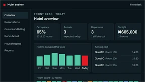
   without scripts. data-end (seconds) stops playback before the closing
   card of the full film, which carries the client's phone number: it is
   required whenever the full film is used. */
.m-film{ margin:0; max-width:1280px; }
.m-film-screen{ position:relative; aspect-ratio:16 / 9; background:#000; }
.m-film-screen video, .m-film-screen img{ display:block; width:100%; height:100%; object-fit:contain; }
.m-film-screen noscript img{ position:absolute; left:0; top:0; }
.m-film-bar{ display:flex; align-items:center; flex-wrap:wrap; gap:12px 24px; margin-top:16px; }
.m-film-credit{ font-size:13px; line-height:1.5; color:var(--m-text-2); }
.m-film-time{ font-family:var(--m-instrument); letter-spacing:var(--m-instrument-track); font-variant-numeric:tabular-nums; font-size:13px; color:var(--m-accent); }
.m-film-toggle, .m-film-sound{
  display:inline-flex; align-items:center; gap:10px; height:44px; padding:0 16px;
  background:transparent; border:1px solid var(--m-line); color:var(--m-text);
  font-family:var(--m-sans); font-size:13px; font-weight:600; cursor:pointer;
  transition:background-color .2s ease, border-color .2s ease;
}
.m-film-toggle:hover, .m-film-sound:hover{ background-color:var(--m-fill-hover); border-color:var(--m-text); }
.m-film-toggle .i-pause, .m-reel-toggle .i-play{ display:none; }
.m-film-toggle.is-playing .i-pause{ display:block; }
.m-film-toggle.is-playing .i-play{ display:none; }
.m-reel-toggle.is-paused .i-play{ display:block; }
.m-reel-toggle.is-paused .i-pause{ display:none; }
/* controls that need the script stay out of sight until it has wired them,
   so none of them is ever a button that does nothing */
[data-film-open]:not(.is-ready), [data-film] .m-film-bar button:not(.is-ready){ visibility:hidden; }
/* Without scripts the film has no source (it loads on the first Play, so
   data-end can keep the closing card off screen), and Chrome would still
   draw its own controls on it: controls that could only do nothing. */
.m-film video:not([src])::-webkit-media-controls{ display:none !important; }

/* The film dialog: the one real film, shown whole, from "See what we make"
   or any [data-film-open]. Escape and Close both close it, focus stays
   inside and returns to the opener. */
.m-reel{
  position:fixed; inset:0; width:100%; height:100%; max-width:none; max-height:none;
  margin:0; padding:0; border:0; overflow:auto; overscroll-behavior:contain;
  background:rgba(10,5,6,.96); color:var(--m-paper);
  font-family:var(--m-sans); line-height:normal;
}
.m-reel[open]{ display:flex; animation:m-fade 280ms ease both; }
.m-reel::backdrop{ background:transparent; }
.m-reel p{ margin:0; }
.m-reel-wrap{
  width:min(1024px, calc(100% - 2 * var(--m-g)), calc((100vh - 240px) * 16 / 9));
  min-width:min(480px, calc(100% - 2 * var(--m-g)));
  margin:auto; padding:32px 0;
  display:grid; grid-template-columns:minmax(0, 1fr) auto; align-items:end;
  grid-template-areas:"kicker close" "title close" "video video" "foot foot";
}
.m-reel-top{ display:contents; }
.m-reel-kicker{ grid-area:kicker; margin-bottom:8px; font-size:11px; font-weight:600; letter-spacing:.18em; text-transform:uppercase; color:var(--m-grey-dark); }
.m-reel-close{
  grid-area:close; display:flex; align-items:center; justify-content:center;
  width:44px; height:44px; padding:0;
  background:transparent; border:1px solid rgba(255,252,252,.5); color:var(--m-paper); cursor:pointer;
  transition:background-color .2s ease, border-color .2s ease;
}
.m-reel-close svg{ width:14px; height:14px; }
.m-reel-close:hover, .m-reel-toggle:hover{ border-color:var(--m-paper); background-color:rgba(255,252,252,.08); }
.m-reel-title{
  grid-area:title; margin:0;
  font-family:var(--m-display); font-size:40px; font-weight:900; font-stretch:90%;
  letter-spacing:-.02em; line-height:1; text-transform:uppercase; color:var(--m-paper);
}
.m-reel-video{ grid-area:video; display:block; width:100%; height:auto; aspect-ratio:16 / 9; margin-top:18px; background:#000; object-fit:contain; }
.m-reel-foot{ grid-area:foot; margin-top:18px; display:flex; align-items:center; justify-content:space-between; flex-wrap:wrap; gap:12px 24px; }
.m-reel-credit{ font-size:13px; line-height:1.5; color:var(--m-lede-dark); }
.m-reel-credit span{ color:var(--m-grey-dark); }
.m-reel-actions{ display:flex; align-items:center; gap:24px; }
.m-reel-toggle{
  display:inline-flex; align-items:center; gap:10px; height:44px; padding:0 16px;
  background:transparent; border:1px solid rgba(255,252,252,.5); color:var(--m-paper);
  font-family:inherit; font-size:13px; font-weight:600; cursor:pointer;
  transition:background-color .2s ease, border-color .2s ease;
}
.m-reel-link{ display:inline-flex; align-items:center; gap:10px; height:44px; font-size:13px; font-weight:600; color:var(--m-paper); }
.m-reel-link:hover{ text-decoration:underline; text-underline-offset:.35em; text-decoration-thickness:1px; }
@media (max-width:599px){
  .m-reel{ background:var(--m-ink); }
  .m-reel[open]{ display:block; }
  .m-reel-wrap{ display:flex; flex-direction:column; align-items:stretch; width:auto; min-width:0; min-height:100%; margin:0; padding:0 var(--m-g) 32px; }
  .m-reel-top{ display:flex; align-items:center; justify-content:space-between; gap:16px; flex:none; height:60px; margin-right:-11px; }
  .m-reel-kicker{ margin:0; font-size:10px; }
  .m-reel-close{ border:0; }
  .m-reel-close svg{ width:16px; height:16px; }
  .m-reel-title{ margin-top:auto; font-size:34px; }
  .m-reel-video{ margin-top:16px; }
  .m-reel-foot{ flex-direction:column; align-items:stretch; margin:16px 0 auto; gap:16px; }
  .m-reel-actions{ justify-content:space-between; gap:16px; }
}


/* 12  FORMS ----------------------------------------------------------------
   Labels above fields, hints and errors under them, wired with
   aria-describedby. Fixed sets are selects (searchable when long, with
   data-m-combo). Anything the site fills in is readonly and looks filled.
   Errors name the fix. js/magik.js validates before sending and never
   shows a raw server error. */
.m-form{ display:grid; gap:24px; max-width:720px; }
.m-form-row{ display:grid; gap:24px; grid-template-columns:repeat(auto-fit, minmax(min(100%, 240px), 1fr)); }
.m-field{ display:grid; gap:8px; align-content:start; min-width:0; }
.m-label{ font-size:14px; font-weight:600; line-height:1.4; color:var(--m-text); }
.m-label-opt{ font-weight:400; color:var(--m-muted); }
.m-input, .m-select, .m-textarea{
  display:block; width:100%; min-height:48px; padding:12px 14px;
  font-family:var(--m-sans); font-size:16px; line-height:1.4; color:var(--m-text);
  background-color:var(--m-ground); border:1px solid var(--m-line); border-radius:0;
  -webkit-appearance:none; appearance:none;
  transition:border-color .2s ease;
}
.m-textarea{ min-height:148px; resize:vertical; }
.m-input::placeholder, .m-textarea::placeholder{ color:var(--m-muted); opacity:1; }
.m-input:hover, .m-select:hover, .m-textarea:hover{ border-color:var(--m-text); }
.m-select-wrap{ position:relative; }
.m-select{ padding-right:48px; cursor:pointer; }
.m-select-wrap::after{
  content:""; position:absolute; right:19px; top:50%; width:8px; height:8px; pointer-events:none;
  border-right:1.5px solid currentColor; border-bottom:1.5px solid currentColor;
  transform:translateY(-70%) rotate(45deg); color:var(--m-text);
}
/* filled by the site: readonly, clearly populated, never editable */
.m-input[readonly], .m-textarea[readonly]{
  background-color:var(--m-fill-hover); border-style:dashed; cursor:default;
}
.m-hint{ font-size:14px; line-height:1.45; color:var(--m-muted); }
.m-error{ font-size:14px; font-weight:500; line-height:1.45; color:var(--m-error); }
.m-error:empty{ display:none; }
.m-field.is-invalid .m-input, .m-field.is-invalid .m-select, .m-field.is-invalid .m-textarea,
.m-field.is-invalid .m-combo-input{ border-color:var(--m-error); box-shadow:inset 0 0 0 1px var(--m-error); }
.m-check{ display:flex; align-items:flex-start; gap:12px; min-height:44px; padding-top:10px; font-size:15px; line-height:1.5; cursor:pointer; }
.m-check input{ flex:none; width:20px; height:20px; margin-top:2px; accent-color:var(--m-red); }
/* honeypot: off screen, out of the tab order, never announced */
.m-hp{ position:absolute !important; left:-9999px; width:1px; height:1px; overflow:hidden; }
/* the searchable select (data-m-combo) */
.m-combo{ position:relative; }
.m-combo-input{ padding-right:48px; }
.m-combo-list{
  position:absolute; left:0; right:0; top:calc(100% + 4px); z-index:30;
  max-height:300px; overflow-y:auto; overscroll-behavior:contain;
  background-color:var(--m-ground); border:1px solid var(--m-text);
}
.m-combo-opt{
  display:flex; align-items:center; width:100%; min-height:44px; padding:8px 14px; gap:12px;
  background:transparent; border:0; text-align:left; font-size:15px; color:var(--m-text); cursor:pointer;
}
.m-combo-opt:hover, .m-combo-opt.is-active{ background-color:var(--m-fill-hover); }
.m-combo-opt[aria-selected="true"]{ font-weight:600; }
.m-combo-group{ display:block; padding:12px 14px 4px; font-size:12px; font-weight:600; letter-spacing:.16em; text-transform:uppercase; color:var(--m-muted); }
.m-combo-empty{ padding:12px 14px; font-size:14px; color:var(--m-muted); }
/* the result: replaces the form on success; the fallback channels on failure */
.m-form-status{ padding:24px; border:1px solid var(--m-line); }
.m-form-status:focus{ outline:none; }
.m-form-status .m-h3 + p{ margin-top:8px; }


/* 13  FOOTER ---------------------------------------------------------------
   The end of every page, one piece (Daniela, 27 September: the close and
   the footer "combined and cute"). Night ink. First the invitation: Have an
   idea? LET'S MAKE IT REAL, in the hero headline's setting, its red square
   full stop stamping in and then hopping and rolling a quarter turn, with
   the one primary action beside it (the square perks up when the action is
   pointed at). Then the red production logo with the ways to reach MAGIK,
   and the four link groups, each heading marked by a small square in its
   world's colour (MAGIK's own is red). Last, the year and the address, the
   legal pages and a red square that takes the reader back to the top
   (js/magik.js "to top"). No ghost wordmark, no sign-off mark. */
.m-footer{
  --m-ground:var(--m-ink); --m-text:var(--m-paper); --m-text-2:var(--m-lede-dark); --m-muted:var(--m-grey-dark);
  --m-rule:rgba(255,252,252,.16); --m-line:rgba(255,252,252,.5);
  --m-fill-hover:rgba(255,252,252,.08); --m-fill-press:rgba(255,252,252,.16);
  --m-footer-logo:30px;
  background-color:var(--m-ground); color:var(--m-text);
  padding:clamp(36px, 3.4vw, 48px) var(--m-pad) 0;
  font-family:var(--m-sans);
}
/* on a dark page the night band meets the page's own ink: a hairline marks it */
body.w-ink > .m-footer, body.w-creative > .m-footer, body.w-velvet > .m-footer{ border-top:1px solid rgba(255,252,252,.16); }

/* the invitation: words on the left, the action on their baseline at the right */
.m-end-call{
  display:flex; flex-wrap:wrap; align-items:flex-end; justify-content:space-between; gap:20px 40px;
  padding-bottom:clamp(24px, 2vw, 28px); border-bottom:1px solid var(--m-rule);
}
.m-end-kicker{ font-size:12px; font-weight:600; letter-spacing:.18em; line-height:16px; text-transform:uppercase; color:var(--m-muted); }
.m-end-title{
  margin-top:10px;
  font-family:var(--m-display); font-weight:900; font-stretch:90%;
  font-size:clamp(40px, 4.45vw, 64px); line-height:.9; letter-spacing:calc(-.03em + 1.5px); word-spacing:.06em;
  text-transform:uppercase; color:var(--m-text); text-wrap:balance;
}
.m-end-cta{ flex:none; }
/* the square: stamped in (section 6), then a hop that rolls it a quarter
   turn (a square looks the same after it, so it ends where it began) */
.m-end-title .m-sq.is-stamped{ animation:m-stamp 420ms cubic-bezier(.3,1.5,.5,1) both, m-end-hop 1s linear 460ms; }
@keyframes m-end-hop{
  0%{ translate:0 0; rotate:0deg; animation-timing-function:cubic-bezier(.2,.65,.4,1); }
  32%{ translate:0 -.5em; rotate:45deg; animation-timing-function:cubic-bezier(.6,0,.8,.35); }
  62%{ translate:0 0; rotate:90deg; animation-timing-function:cubic-bezier(.2,.65,.4,1); }
  80%{ translate:0 -.14em; rotate:90deg; animation-timing-function:cubic-bezier(.6,0,.8,.35); }
  94%, 100%{ translate:0 0; rotate:90deg; }
}
@media (prefers-reduced-motion:no-preference){
  .m-end-title .m-sq{ transition:translate .4s cubic-bezier(.3,1.6,.5,1), rotate .4s cubic-bezier(.3,1.6,.5,1); }
  .m-end-call:has(.m-end-cta:hover, .m-end-cta:focus-visible) .m-end-title .m-sq{ translate:0 -.28em; rotate:45deg; }
}

/* the logo and the ways to reach MAGIK, then the four link groups */
.m-end-grid{
  display:grid; grid-template-columns:minmax(200px, 1fr) minmax(0, 3fr); gap:20px 40px;
  padding:clamp(20px, 1.8vw, 24px) 0 clamp(16px, 1.4vw, 20px);
}
/* the logo is the production artwork (/logo-red.png, production's own
   #DA202D: never recoloured) */
.m-footer-logo{ display:inline-flex; align-items:center; height:32px; }
.m-footer-logo img{ display:block; width:auto; height:var(--m-footer-logo); max-width:none; }
.m-end-reach{ margin-top:8px; list-style:none; }
.m-end-reach li{ display:block; }
.m-end-nav{ display:grid; grid-template-columns:repeat(4, minmax(0, 1fr)); gap:16px 24px; }
.m-end-col ul{ list-style:none; }
.m-end-head{
  display:flex; align-items:center; gap:10px; min-height:32px;
  font-size:12px; font-weight:600; letter-spacing:.18em; line-height:16px; text-transform:uppercase; color:var(--m-muted);
}
.m-end-head::before{ content:""; flex:none; width:7px; height:7px; background:var(--m-end-mark, var(--m-red)); }
.m-end-col--creative{ --m-end-mark:var(--c-tungsten); }
.m-end-col--tech{ --m-end-mark:var(--t-steel); }
.m-end-col--pathways{ --m-end-mark:var(--p-laterite); }
.m-end-head a{ display:inline-flex; align-items:center; min-height:32px; color:var(--m-text); }
.m-end-col li a, .m-end-reach a{
  display:inline-flex; align-items:center; min-height:30px; padding:2px 0;
  font-size:14px; line-height:1.35; color:var(--m-text); overflow-wrap:anywhere;
}
.m-end-head a:hover, .m-end-col li a:hover, .m-end-reach a:hover{ text-decoration:underline; text-underline-offset:.3em; text-decoration-thickness:1px; }

/* the year and the address, the legal pages, back to the top */
.m-end-base{
  display:flex; flex-wrap:wrap; align-items:center; gap:0 28px;
  padding:4px 0 8px; border-top:1px solid var(--m-rule);
  font-size:13px; line-height:1.5; color:var(--m-muted);
}
.m-end-base > p{ flex:1 1 320px; padding:12px 0; }
.m-footer-legal{ display:flex; align-items:center; flex-wrap:wrap; gap:0 24px; }
.m-footer-legal a{ position:relative; display:inline-flex; align-items:center; min-height:44px; color:var(--m-paper); }
/* short words still get a 44px-wide target, without moving them */
.m-footer-legal a::before{ content:""; position:absolute; top:0; bottom:0; left:-8px; right:-8px; }
.m-footer-legal a:hover{ text-decoration:underline; text-underline-offset:.3em; text-decoration-thickness:1px; }
.m-end-top{
  display:inline-flex; align-items:center; gap:10px; min-height:44px;
  font-size:12px; font-weight:600; letter-spacing:.18em; text-transform:uppercase; color:var(--m-text);
}
.m-end-top i{ flex:none; width:10px; height:10px; background:var(--m-red); transition:translate .35s cubic-bezier(.3,1.6,.5,1); }
.m-end-top:hover i, .m-end-top:focus-visible i{ translate:0 -5px; }

/* tablets: the logo and the ways to reach MAGIK on one row above the groups */
@media (max-width:1023px){
  .m-end-grid{ grid-template-columns:minmax(0, 1fr); }
  .m-end-brand{ display:flex; flex-wrap:wrap; align-items:center; gap:0 32px; }
  .m-end-reach{ display:flex; flex-wrap:wrap; gap:0 24px; margin-top:0; }
}
/* below 900px the action goes under the words */
@media (max-width:899px){
  .m-end-call{ flex-direction:column; align-items:flex-start; }
  .m-end-title{ font-size:clamp(36px, 6.6vw, 52px); }
}
/* phones: the action across the width, the three divisions side by side
   and MAGIK's own pages on one line under them */
@media (max-width:599px){
  .m-footer{ --m-footer-logo:28px; }
  .m-end-call{ align-items:stretch; gap:18px; }
  .m-end-title{ font-size:clamp(34px, 10.2vw, 44px); }
  .m-end-cta{ width:100%; }
  .m-end-brand{ gap:0 20px; }
  .m-end-reach{ gap:0 20px; }
  .m-end-nav{ grid-template-columns:repeat(3, minmax(0, 1fr)); gap:12px 14px; }
  .m-end-head{ gap:7px; font-size:11px; letter-spacing:.12em; }
  .m-end-head::before{ width:6px; height:6px; }
  .m-end-col--magik{ grid-column:1 / -1; display:flex; flex-wrap:wrap; align-items:center; gap:0 20px; }
  .m-end-col--magik ul{ display:flex; flex-wrap:wrap; gap:0 20px; }
  .m-end-base{ gap:0 24px; }
  .m-end-base > p{ flex-basis:100%; padding-bottom:0; }
  .m-end-top{ margin-left:auto; }
}
/* the narrowest phones: Creative, then Tech over Pathways beside it */
@media (max-width:359px){
  .m-end-nav{ grid-template-columns:repeat(2, minmax(0, 1fr)); grid-template-areas:"c t" "c p" "m m"; }
  .m-end-col--creative{ grid-area:c; }
  .m-end-col--tech{ grid-area:t; }
  .m-end-col--pathways{ grid-area:p; }
  .m-end-col--magik{ grid-area:m; }
}


/* 14  REVEAL AND MOTION ----------------------------------------------------
   Keyframes shared by the header, menu and dialogs. */
@keyframes m-fade{ from{ opacity:0; } to{ opacity:1; } }
@keyframes m-wipe{ from{ clip-path:inset(0 0 100% 0); } to{ clip-path:inset(0 0 0 0); } }
@keyframes m-light-up{ from{ opacity:.3; } to{ opacity:1; } }

/* Reveal: a light change as a block enters, never movement, and never on
   a film frame or anything that holds one. It is visible at rest: before a
   block reaches the screen, after it arrives, without scripts, in browsers
   without scroll-driven animation and under reduced motion, it is simply
   there. */
@supports (animation-timeline:view()){
  .m-reveal{
    animation:m-light-up linear forwards;
    animation-timeline:view();
    animation-range:entry 0% entry 90%;
  }
}

/* The slow-network loader (inline at the top of every page's head) sets
   html.is-loading while it covers the page. Meanwhile the page's entrances
   hold on their first frame: the homepage titles and the header's entrance
   over them (css/hero.css, locked, is untouched: this only pauses it) and
   the square full stops' stamp, so each starts after the cut to the page. */
html.is-loading .mh-hero, html.is-loading .mh-hero *, html.is-loading .mh-hero *::before, html.is-loading .mh-hero *::after,
html.is-loading .m-header, html.is-loading .m-header *, html.is-loading .m-sq{ animation-play-state:paused !important; }

/* Reduced motion: every element's resting style is its final frame, so
   switching animation and transition off shows the composed page at once. */
@media (prefers-reduced-motion:reduce){
  html{ scroll-behavior:auto; }
  *, *::before, *::after{ animation:none !important; transition:none !important; }
}

/* 15  WHERE NEXT -----------------------------------------------------------
   The next-world band, on the three division overview pages only, as the
   last thing before the footer: the next division's image, "Next · MAGIK
   Tech", its verb in the voice, an arrow. Creative leads to Tech, Tech to
   Pathways, Pathways to Creative. The whole row is the link; nothing moves
   on hover.
   <nav class="m-next" aria-label="Next division">
     <a class="m-next-link" href="/tech">
       <span class="m-next-thumb"><img src="/media/tech-desk-288.webp" width="288" height="162" alt="" loading="lazy"></span>
       <span class="m-next-text"><span class="m-next-kicker">Next &middot; MAGIK Tech</span><span class="m-next-verb">Make it work.</span></span>
       <span class="m-next-arrow" aria-hidden="true">(the arrow svg)</span>
     </a>
   </nav> */
.m-next{
  --dv-dark:1;
  padding:0 var(--m-pad);
  background-color:var(--m-ink); color:var(--m-paper);
  border-top:1px solid rgba(255,252,252,.16);
  font-family:var(--m-sans);
}
.m-next + .m-footer{ border-top:1px solid rgba(255,252,252,.16); }
.m-next-link{
  display:flex; align-items:center; gap:clamp(16px, 2vw, 28px);
  min-height:120px; padding:20px 0; color:var(--m-paper);
}
.m-next-thumb{ position:relative; flex:none; width:clamp(72px, 20vw, 96px); aspect-ratio:16 / 9; overflow:hidden; background:#000; }
.m-next-thumb::after{ content:""; position:absolute; inset:0; border:1px solid rgba(255,252,252,.14); pointer-events:none; }
.m-next-thumb img{ display:block; width:100%; height:100%; object-fit:cover; object-position:var(--thumb-pos, 50% 50%); }
.m-next-text{ display:flex; flex-direction:column; gap:6px; min-width:0; margin-right:auto; }
.m-next-kicker{ font-size:12px; font-weight:600; letter-spacing:.16em; line-height:16px; text-transform:uppercase; color:var(--m-grey-dark); }
/* the verb is the division's own title from the hero's opening
   (MAKE IT WORK.), in the hero headline's setting */
.m-next-verb{
  font-family:var(--m-display); font-weight:900; font-stretch:90%;
  font-size:clamp(26px, 2.6vw, 38px); line-height:.95; letter-spacing:-.01em;
  text-transform:uppercase; color:var(--m-paper);
}
/* MOVE IT FORWARD. keeps to its column on the smallest phones */
@media (max-width:359px){
  .m-next-verb{ font-stretch:82%; }
}
.m-next-arrow{
  display:inline-flex; align-items:center; justify-content:center; flex:none;
  width:44px; height:44px; border:1px solid rgba(255,252,252,.5); border-radius:50%;
  transition:background-color .2s ease, border-color .2s ease;
}
.m-next-link:hover .m-next-verb{ text-decoration:underline; text-underline-offset:.14em; text-decoration-thickness:1px; }
.m-next-link:hover .m-next-arrow{ background-color:rgba(255,252,252,.08); border-color:var(--m-paper); }


/* 16  DIVISION COMPONENTS --------------------------------------------------
   The one vocabulary for Creative, Tech and Pathways (and the homepage below
   the hero), adopted from the Codex division pages and brought into this
   system: #FFFCFC or ink grounds only, one edge (.m-wrap), labels 12px and
   up, body 16px and up, nothing moves on hover. docs/redesign/DESIGN-SYSTEM.md
   section 13 has the markup for each piece.

   Division accent: .dv-creative (red), .dv-tech (steel #80B2C6),
   .dv-pathways (sage #8EAE7C) on <body> or on any section. Fills and lines
   use --dv-accent; small accent type uses --dv-on, which each piece below
   works out for its own ground (--dv-dark, set by every dark scope and dark
   piece): text-safe on ink and on #FFFCFC alike. */
.dv-creative{ --dv-accent:#E31B23; --dv-accent-dark:#F0444A; --dv-accent-light:#B8141B; --dv-accent-ink:#FFFCFC; }
.dv-tech{ --dv-accent:#80B2C6; --dv-accent-dark:#80B2C6; --dv-accent-light:#3F6E82; --dv-accent-ink:#0A0506; }
.dv-pathways{ --dv-accent:#8EAE7C; --dv-accent-dark:#8EAE7C; --dv-accent-light:#397253; --dv-accent-ink:#0A0506; }
.m-crumb-sep, .dv-eyebrow, .dv-link, .dv-card, .dv-callouts, .dv-rows, .dv-row, .dv-fold, .dv-switch, .dv-journey{
  --dv-on:var(--dv-accent-light);
  --dv-on:color-mix(in srgb, var(--dv-accent-dark) calc(var(--dv-dark) * 100%), var(--dv-accent-light));
}

/* SECTION: a division scene. Paint it with a scope: .w-master (#FFFCFC) or
   .w-ink (ink). Tighter than .m-section, as the Codex pages were; it clips
   sideways overflow, so a bleed (the journey's lines, a card rail) can
   never widen the page. */
.dv-section{
  position:relative; overflow-x:clip;
  padding-top:clamp(64px, 6.2vw, 96px); padding-bottom:clamp(64px, 6.2vw, 96px);
  background-color:var(--m-ground); color:var(--m-text);
  scroll-margin-top:66px;
}
@media (max-width:899px){ .dv-section{ scroll-margin-top:60px; } }
.dv-section--rule{ border-top:1px solid var(--m-rule); }

/* EYEBROW: the label over a title, in the division accent */
.dv-eyebrow{
  display:block; font-size:12px; font-weight:650; letter-spacing:.15em; line-height:16px;
  text-transform:uppercase; color:var(--dv-on);
}

/* HERO: the first scene of a division page or sub-page. Ink, with the
   accent's light spilling in at the top right; crumb, eyebrow, the title
   with its voice turn, one lede, one primary button; the framed visual on
   the right. Stacks at 960px (copy first). The header over it is
   data-tone="dark". */
.dv-hero{
  --dv-dark:1;
  --m-ground:var(--m-ink); --m-text:var(--m-paper); --m-text-2:var(--m-lede-dark); --m-muted:var(--m-grey-dark);
  --m-rule:rgba(255,252,252,.16); --m-line:rgba(255,252,252,.5); --m-voice:var(--m-paper); --m-accent:var(--m-grey-dark);
  --m-red-text:var(--m-red-lift); --m-error:#FF7378;
  --m-fill-hover:rgba(255,252,252,.08); --m-fill-press:rgba(255,252,252,.16);
  position:relative; isolation:isolate; overflow-x:clip;
  padding:clamp(12px, 2vw, 28px) 0 clamp(64px, 5.8vw, 84px);
  background-color:var(--m-ground); color:var(--m-text);
}
.dv-hero::before{
  content:""; position:absolute; inset:0; z-index:-1; pointer-events:none;
  background:radial-gradient(ellipse at 87% 28%, color-mix(in srgb, var(--dv-accent) 17%, transparent), transparent 44%);
}
/* a light-ground hero (Daniela, 27 September: the Tech overview). Same
   shape, same header, same visual frame: only the ground and text swap to
   the site's own #FFFCFC scene, and the eyebrow takes the division's
   on-light accent, exactly as a light .dv-section does. */
.dv-hero--light{
  --dv-dark:0;
  --m-ground:var(--m-paper); --m-text:var(--m-ink); --m-text-2:#2A2425; --m-muted:var(--m-grey-light);
  --m-rule:rgba(10,5,6,.14); --m-line:rgba(10,5,6,.5); --m-voice:var(--m-ink); --m-accent:var(--m-grey-light);
  --m-red-text:var(--m-red-press); --m-error:var(--m-red-press);
  --m-fill-hover:rgba(10,5,6,.08); --m-fill-press:rgba(10,5,6,.16);
}
.dv-hero--light .m-btn--primary svg path{ stroke:#FFFCFC; }
.dv-hero .m-crumb{ margin-bottom:clamp(8px, 1.3vw, 18px); }
.dv-hero-grid{ display:grid; grid-template-columns:minmax(0, .93fr) minmax(0, 1.07fr); gap:clamp(34px, 6vw, 88px); align-items:center; }
.dv-hero-grid > *{ min-width:0; }
.dv-hero--single .dv-hero-grid{ grid-template-columns:minmax(0, 1fr); }
.dv-title{
  max-width:650px; margin-top:22px;
  font-family:var(--m-sans); font-weight:700; font-size:clamp(48px, 6.67vw, 96px);
  line-height:.91; letter-spacing:-.045em; color:var(--m-text); text-wrap:balance;
}
.dv-title--m{ max-width:760px; font-size:clamp(44px, 6vw, 80px); }
/* the voice turn inside a division title, section title or close is set
   in section 6: the hero headline's setting, at the title's own size */
.dv-lede{ max-width:545px; margin-top:22px; font-size:18px; line-height:1.65; color:var(--m-muted); }
.dv-hero-copy .m-actions{ margin-top:30px; }

/* VISUAL: the framed panel beside the hero copy. An image or picture fills
   it (cover); an interface sits on a .dv-field inside it. Labels sit in the
   corners, 12px; an overlaid statement sits on a bottom scrim. The --whole
   variant shows the work at its own shape: no crop, no frame, no scrim. */
.dv-visual{ position:relative; margin:0; min-width:0; }
.dv-visual-frame{
  position:relative; display:flex; flex-direction:column; justify-content:center;
  min-height:440px; overflow:hidden; isolation:isolate;
  background-color:#141B1E; border:1px solid rgba(255,255,255,.14);
}
.dv-visual-frame > img, .dv-visual-frame > video, .dv-visual-frame > picture, .dv-visual-frame > picture > img{
  position:absolute; inset:0; width:100%; height:100%; object-fit:cover; object-position:var(--visual-pos, 50% 50%);
}
.dv-visual-frame--scrim::after{
  content:""; position:absolute; inset:35% 0 0; z-index:1; pointer-events:none;
  background:linear-gradient(0deg, rgba(8,13,11,.9), transparent);
}
.dv-visual-index, .dv-visual-tag{
  position:absolute; z-index:3; top:17px; max-width:calc(100% - 36px);
  font-size:12px; font-weight:600; letter-spacing:.13em; line-height:1.5; text-transform:uppercase;
  color:#FFFFFF; text-shadow:0 1px 9px rgba(0,0,0,.8);
}
.dv-visual-index{ left:18px; }
.dv-visual-tag{ right:18px; text-align:right; }
/* beside an index, a tag wraps to balanced lines in its corner, so the two
   never meet; at 720px and below it sits under the index */
.dv-visual-index ~ .dv-visual-tag{ max-width:min(58%, 330px); text-wrap:balance; }
@media (max-width:720px){
  .dv-visual-index ~ .dv-visual-tag{ left:18px; right:18px; top:42px; max-width:none; text-align:left; }
}
.dv-visual-copy{ position:absolute; z-index:2; left:25px; right:24px; bottom:23px; color:#FFFFFF; }
.dv-visual-statement{ max-width:500px; font-size:clamp(27px, 3.4vw, 45px); font-weight:650; line-height:1.02; letter-spacing:-.03em; color:#FFFFFF; }
.dv-visual-note{ display:block; margin-top:14px; font-size:12px; font-weight:600; letter-spacing:.12em; line-height:1.5; text-transform:uppercase; color:rgba(255,255,255,.86); }
.dv-visual-cap{ margin-top:12px; font-size:12px; font-weight:500; letter-spacing:.14em; line-height:1.5; color:var(--m-muted); }
.dv-visual--whole .dv-visual-frame{ display:block; min-height:0; background:none; border:0; }
.dv-visual--whole .dv-visual-frame > img, .dv-visual--whole .dv-visual-frame > picture, .dv-visual--whole .dv-visual-frame > picture > img{ position:static; height:auto; }

/* FIELD and WINDOW: where a Tech interface is shown. The field is a tinted
   radial room (Tech steel by default; --hotel teal, --school blue,
   --custom violet). The window is the product's frame on it: a top bar with
   the red mark and the system's plain name ("Hotel system"), then the
   interface. --tilt turns it 4 degrees from 1180px up. */
.dv-field{
  --dv-f1:#33596B; --dv-f2:#172B36; --dv-f3:#0C161D;
  position:relative; display:flex; flex-direction:column; justify-content:center;
  padding:clamp(24px, 3.4vw, 48px) clamp(12px, 2.1vw, 30px);
  background:radial-gradient(ellipse at 70% 15%, var(--dv-f1), var(--dv-f2) 47%, var(--dv-f3));
  color:#E9F1F0; overflow:hidden;
}
.dv-field--hotel{ --dv-f1:#245265; --dv-f2:#10242E; --dv-f3:#0C171D; }
.dv-field--school{ --dv-f1:#395875; --dv-f2:#182B3B; --dv-f3:#111C27; }
.dv-field--custom{ --dv-f1:#5A436D; --dv-f2:#29243E; --dv-f3:#181827; }
.dv-window{
  position:relative; z-index:1; width:100%; max-width:var(--dv-window-max, 590px); margin:auto;
  background-color:#0B1820; border:1px solid rgba(175,203,211,.3); box-shadow:0 22px 60px rgba(0,0,0,.5);
  color:#E9F1F0; font-family:var(--m-sans);
}
.dv-window-bar{
  display:flex; align-items:center; gap:10px; min-height:44px; padding:8px 15px;
  border-bottom:1px solid rgba(255,255,255,.12);
  font-size:14px; font-weight:600; line-height:1.3;
}
.dv-window-bar::before{ content:""; flex:none; width:10px; height:10px; background:var(--m-red); }
.dv-window-bar small{ margin-left:auto; font-size:12px; font-weight:500; color:#A9BBBD; }
@media (min-width:1180px){ .dv-window--tilt{ transform:perspective(1100px) rotateY(-4deg); } }

/* PRODUCT and CALLOUTS: a product shown full width, with its numbered
   modules under the frame (1 Bookings and reservations ...). The same
   numbers may sit on the matching nav items inside the interface. */
.dv-product{ margin:0; min-width:0; }
.dv-callouts{
  display:flex; flex-wrap:wrap; gap:10px 28px; margin-top:18px; list-style:none;
  font-size:15px; line-height:1.4; color:var(--m-text-2);
}
.dv-callouts li{ display:inline-flex; align-items:center; gap:10px; }
.dv-callout-num{
  display:inline-flex; align-items:center; justify-content:center; flex:none; width:24px; height:24px;
  border:1px solid var(--dv-on); color:var(--dv-on);
  font-size:12px; font-weight:650; line-height:1; font-variant-numeric:tabular-nums;
}

/* SECTION HEAD: eyebrow and title on the left, one short line or one link
   on the right, bottoms aligned; --rule adds the hairline under it.
   Stacks at 720px. */
.dv-head{ display:flex; align-items:flex-end; justify-content:space-between; gap:16px 32px; margin-bottom:32px; }
.dv-head > :first-child{ min-width:0; }
.dv-head--rule{ padding-bottom:24px; border-bottom:1px solid var(--m-rule); }
.dv-h2{
  margin-top:12px; font-family:var(--m-sans); font-weight:700; font-size:clamp(36px, 4.6vw, 58px);
  line-height:.98; letter-spacing:-.03em; color:var(--m-text); text-wrap:balance;
}
.dv-head-aside{ flex:none; max-width:340px; font-size:16px; line-height:1.6; color:var(--m-muted); }
.dv-head > .m-go, .dv-head > .dv-link{ flex:none; }
/* a link set in text, with the accent arrow (the Codex division link) */
.dv-link{
  display:inline-flex; align-items:center; gap:12px; min-height:44px;
  font-size:16px; font-weight:600; line-height:1.3; color:var(--m-text);
  text-decoration:underline; text-decoration-color:var(--m-line); text-decoration-thickness:1px; text-underline-offset:.45em;
}
.dv-link:hover{ text-decoration-color:currentColor; text-decoration-thickness:2px; }
.dv-link svg{ flex:none; color:var(--dv-on); }

/* CARDS: the image card. The whole card is one link: the picture on top
   (16:9, shown as it is), then the title, one line, the arrow at the
   bottom right. Optional: a tag on the picture's darkened foot, a pill in
   its top-left corner, the accent bar on its bottom edge, a kicker over the
   title, the round arrow. Hover: the border takes the accent and the
   picture eases in (1.045); the card never moves. 4 up (--3: 3 up), 2 up at
   960px, 1 up at 620px; --rail turns a phone column into a sideways rail
   that bleeds to the screen edges and peeks the next card. On a 2-up
   tablet, an odd last card of a --3 grid becomes one wide row. */
.dv-cards{ --dv-cols:4; display:grid; grid-template-columns:repeat(var(--dv-cols), minmax(0, 1fr)); gap:12px; list-style:none; }
.dv-cards--3{ --dv-cols:3; gap:16px; }
.dv-cards > li{ position:relative; display:flex; min-width:0; }
.dv-card{
  position:relative; display:flex; flex-direction:column; width:100%; min-width:0;
  padding-bottom:60px;
  background-color:#FFFFFF;
  background-color:color-mix(in srgb, #15191C calc(var(--dv-dark) * 100%), #FFFFFF);
  border:1px solid rgba(10,5,6,.09);
  border-color:color-mix(in srgb, rgba(255,252,252,.14) calc(var(--dv-dark) * 100%), rgba(10,5,6,.09));
  color:var(--m-text);
  transition:border-color .22s ease;
}
.dv-card:hover{ border-color:var(--dv-accent); }
.dv-card-media{ position:relative; display:block; flex:none; aspect-ratio:16 / 9; overflow:hidden; background-color:#171719; }
.dv-card-media > img, .dv-card-media > picture > img{
  display:block; width:100%; height:100%; object-fit:cover; object-position:var(--media-pos, 50% 50%);
  transition:transform .55s var(--m-dimmer);
}
.dv-card:hover .dv-card-media > img, .dv-card:hover .dv-card-media > picture > img{ transform:scale(1.045); }
.dv-card-media--screen{ aspect-ratio:auto; min-height:245px; }
.dv-card-media:has(.dv-card-tag)::after{
  content:""; position:absolute; inset:25% 0 0; pointer-events:none;
  background:linear-gradient(0deg, rgba(7,9,11,.88), transparent);
}
.dv-card-tag{ position:absolute; z-index:1; left:17px; right:17px; bottom:13px; font-size:12px; font-weight:600; letter-spacing:.08em; line-height:1.4; color:#FFFFFF; }
.dv-card-pill{
  position:absolute; z-index:2; top:18px; left:18px; padding:8px 12px; border-radius:999px;
  background-color:rgba(8,12,16,.72); color:#FFFFFF;
  font-size:12px; font-weight:650; letter-spacing:.12em; line-height:1; text-transform:uppercase;
}
.dv-card-bar{ position:absolute; z-index:2; left:18px; bottom:0; width:34px; height:3px; background-color:var(--dv-accent); transition:width .45s var(--m-dimmer); }
.dv-card:hover .dv-card-bar{ width:62px; }
.dv-card-body{ display:flex; flex-direction:column; align-items:flex-start; gap:8px; min-width:0; padding:18px 20px 0; }
.dv-card-kicker{ font-size:12px; font-weight:600; letter-spacing:.14em; line-height:16px; text-transform:uppercase; color:var(--dv-on); }
.dv-card-title{ font-family:var(--m-sans); font-size:21px; font-weight:650; line-height:1.15; letter-spacing:-.02em; color:var(--m-text); }
.dv-card-line{ max-width:37ch; font-size:16px; line-height:1.5; color:var(--m-muted); }
.dv-card-arrow{
  position:absolute; right:16px; bottom:14px; display:inline-flex; align-items:center; justify-content:center;
  width:32px; height:32px; color:var(--dv-on);
}
.dv-card-arrow--ring{
  width:40px; height:40px; border:1px solid color-mix(in srgb, currentColor 30%, transparent); border-radius:50%; color:var(--m-text);
  transition:background-color .3s ease, border-color .3s ease, color .3s ease, transform .3s ease;
}
.dv-card:hover .dv-card-arrow--ring{ background-color:var(--dv-accent); border-color:var(--dv-accent); color:var(--dv-accent-ink); transform:rotate(45deg); }
@media (max-width:960px){ .dv-cards{ --dv-cols:2; } }
@media (min-width:621px) and (max-width:960px){
  .dv-cards--3 > li:last-child:nth-child(odd){ grid-column:1 / -1; }
  .dv-cards--3 > li:last-child:nth-child(odd) .dv-card{ flex-direction:row; padding-bottom:0; }
  .dv-cards--3 > li:last-child:nth-child(odd) .dv-card-media{ width:50%; aspect-ratio:auto; min-height:220px; }
  .dv-cards--3 > li:last-child:nth-child(odd) .dv-card-body{ flex:1; padding:20px 20px 60px; }
}
@media (max-width:620px){
  .dv-cards{ --dv-cols:1; }
  .dv-cards--rail{
    display:flex; gap:12px; overflow-x:auto; overscroll-behavior-x:contain; scroll-snap-type:x mandatory;
    margin-left:calc(-1 * var(--m-g)); margin-right:calc(-1 * var(--m-g));
    padding:0 var(--m-g) 2px; scroll-padding:0 var(--m-g);
  }
  .dv-cards--rail > li{ flex:0 0 min(80vw, 320px); scroll-snap-align:start; }
  .dv-cards--rail .dv-card-media{ aspect-ratio:4 / 3; }
  /* a coded screen keeps its own height in a rail (it drops content by its
     own container width instead of being cropped) */
  .dv-cards--rail .dv-card-media--screen{ aspect-ratio:auto; }
}

/* ROWS: full-row links or plain rows on hairlines (the doors of a close,
   the steps of a process): label, one line, the arrow. --dv-row-label sets
   the label column (220px). Hover fills the row with light; nothing moves.
   At 460px the line goes under the label. */
.dv-rows{ list-style:none; border-top:1px solid var(--m-rule); }
.dv-row{
  position:relative; isolation:isolate;
  display:grid; grid-template-columns:minmax(0, var(--dv-row-label, 220px)) minmax(0, 1fr) auto;
  align-items:center; column-gap:24px; row-gap:4px; min-height:64px; padding:14px 0;
  border-bottom:1px solid var(--m-rule); color:var(--m-text);
}
a.dv-row::before{
  content:""; position:absolute; z-index:-1; top:0; bottom:0; left:-12px; right:-12px;
  background-color:var(--m-fill-hover); opacity:0; transition:opacity .2s ease;
}
a.dv-row:hover::before{ opacity:1; }
.dv-row-label{ font-size:18px; font-weight:600; line-height:1.3; }
.dv-row-line{ font-size:16px; line-height:1.5; color:var(--m-muted); }
.dv-row-arrow{ display:inline-flex; color:var(--dv-on); }
@media (max-width:460px){
  .dv-row{ grid-template-columns:minmax(0, 1fr) auto; }
  .dv-row-label, .dv-row-line{ grid-column:1; }
  .dv-row-arrow{ grid-column:2; grid-row:1 / span 2; }
}

/* FOLDS: detail kept one tap away (What you get, What shapes the quote,
   Questions). Native <details>, closed by default, 64px rows on hairlines,
   the accent plus. No script. */
.dv-folds{ border-top:1px solid var(--m-rule); }
.dv-fold{ border-bottom:1px solid var(--m-rule); }
.dv-fold > summary{
  display:flex; align-items:center; justify-content:space-between; gap:16px;
  min-height:64px; padding:10px 0; cursor:pointer; list-style:none;
  font-size:18px; font-weight:600; line-height:1.3; color:var(--m-text);
}
.dv-fold > summary::-webkit-details-marker{ display:none; }
.dv-fold > summary::after{
  content:""; flex:none; width:14px; height:14px;
  background:
    linear-gradient(var(--dv-on), var(--dv-on)) center / 14px 2px no-repeat,
    linear-gradient(var(--dv-on), var(--dv-on)) center / 2px 14px no-repeat;
}
.dv-fold[open] > summary::after{ background:linear-gradient(var(--dv-on), var(--dv-on)) center / 14px 2px no-repeat; }
.dv-fold > summary:hover{ text-decoration:underline; text-underline-offset:.3em; text-decoration-thickness:1px; }
.dv-fold-body{ max-width:720px; padding:0 0 24px; font-size:16px; line-height:1.6; color:var(--m-text-2); }
.dv-fold-body > * + *{ margin-top:.8em; }
.dv-fold-body ul{ padding-left:1.1em; }

/* SWITCHER: the sibling pages of one division as a segmented row (Hotel ·
   School · Custom). 44px; the page you are on is marked by the red square
   and aria-current="page". Full width, three equal parts, on a phone. */
.dv-switch{ display:inline-flex; flex-wrap:wrap; max-width:100%; border:1px solid var(--m-rule); }
.dv-switch a{
  display:inline-flex; align-items:center; justify-content:center; gap:6px;
  min-height:44px; padding:0 18px; font-size:14px; font-weight:600; color:var(--m-muted);
  transition:background-color .2s ease, color .2s ease;
}
.dv-switch a + a{ border-left:1px solid var(--m-rule); }
.dv-hero .dv-switch{ margin:4px 0 clamp(20px, 2.4vw, 32px); }
.dv-switch a:hover{ color:var(--m-text); background-color:var(--m-fill-hover); }
.dv-switch a[aria-current]{ color:var(--m-text); }
.dv-switch a[aria-current]::after{ content:""; flex:none; width:6px; height:6px; background:var(--m-red); transform:translateY(calc(.304em - 3px)); }
@media (max-width:420px){
  .dv-switch{ display:flex; flex-wrap:nowrap; width:100%; }
  .dv-switch a{ flex:1 1 0; min-width:0; padding:0 8px; }
}

/* JOURNEY: one line, walked together (Pathways; compact on the homepage;
   the academy's route on a vertical rail). The line is a slim strip of
   pitch: a 5px green body with soft mowing stripes along it (--jn-grass-a
   and -b, 32px each, eased into each other) and a faint edge of short
   blades on top (on the right of a vertical rail), so from close up it
   reads as grass and at a glance as the line. It enters from the screen's
   left edge, runs through the numbered markers and stops in the red
   square, then turns dotted to the right edge. The people stand on it; a
   parent or guardian stands a step in front (the page's drawings), and
   has no line of their own. Each stage: a scene the page draws, the
   marker, the name, the voice line, one body line. Horizontal from 1024px
   (--compact: from 768px), vertical below. js/magik.js fills the line as
   the reader arrives and never undraws it; without the script or under
   reduced motion it is fully drawn. The section around it must clip
   (.dv-section does).
   Geometry: the figures stand at the line's centre c (the foot of the
   scene); the body runs from c - 2px to c + 3px and the blades rise up to
   3px above it, so a strip is 8px from blade tip to foot. The body and the
   blades are one shape (a mask), painted by the stripes, so the blades
   carry the stripes too. Whole pixels throughout, so it stays crisp. */
.dv-journey, .dv-journey-key{
  --jn-player:#347E62; --jn-dots:#347E62; --jn-end:#E31B23;
  --jn-grass-a:#3D8B6D; --jn-grass-b:#2E7357; --jn-rest-a:#D3DCD2; --jn-rest-b:#C6D1C5;
  --jn-mk-bg:var(--m-ground, #FFFCFC); --jn-mk-line:#AAB9A9; --jn-mk-text:#536059; --jn-mk-on:#FFFFFF;
  --jn-name:#17201C; --jn-voice:#397253; --jn-body:#536059; --jn-link:#24684F;
  /* the strip, across (x) and down (y): stripes, and the mask that cuts
     the blade edge and the body */
  --jn-grass-x:linear-gradient(90deg, var(--jn-grass-a) 0 26px, var(--jn-grass-b) 32px 58px, var(--jn-grass-a) 64px) 0 0 / 64px 100% repeat-x;
  --jn-rest-x:linear-gradient(90deg, var(--jn-rest-a) 0 26px, var(--jn-rest-b) 32px 58px, var(--jn-rest-a) 64px) 0 0 / 64px 100% repeat-x;
  --jn-grass-y:linear-gradient(180deg, var(--jn-grass-a) 0 26px, var(--jn-grass-b) 32px 58px, var(--jn-grass-a) 64px) 0 0 / 100% 64px repeat-y;
  --jn-rest-y:linear-gradient(180deg, var(--jn-rest-a) 0 26px, var(--jn-rest-b) 32px 58px, var(--jn-rest-a) 64px) 0 0 / 100% 64px repeat-y;
  --jn-mask-x:url("data:image/svg+xml,%3Csvg xmlns='http://www.w3.org/2000/svg' viewBox='0 0 36 3.5'%3E%3Cpath d='M1 3.5L.4 1.2L1.9 3.5ZM2 3.5L2.6 .2L2.9 3.5ZM3 3.5L4.3 1.5L3.8 3.5ZM9.6 3.5L9.2 1.9L10.5 3.5ZM10.6 3.5L11.4 .9L11.5 3.5ZM17.2 3.5L16.6 1.4L18.1 3.5ZM18.2 3.5L18.7 .3L19.1 3.5ZM19.2 3.5L20.6 1.8L20 3.5ZM24.8 3.5L24.6 2.2L25.7 3.5ZM25.8 3.5L26.5 1.1L26.6 3.5ZM30.3 3.5L29.8 1.6L31.2 3.5ZM31.3 3.5L31.9 .4L32.2 3.5ZM32.3 3.5L33.6 2L33.1 3.5Z'/%3E%3Cpath fill-opacity='.6' d='M6.4 3.5L6.9 2.4L7.2 3.5ZM14.2 3.5L14.5 2.6L15 3.5ZM22 3.5L22.5 2.7L22.8 3.5ZM35 3.5L35.5 2.5L35.8 3.5Z'/%3E%3C/svg%3E") 0 0 / 36px 3.5px repeat-x, linear-gradient(#000 0 0) 0 100% / 100% 5px no-repeat;
  --jn-mask-y:url("data:image/svg+xml,%3Csvg xmlns='http://www.w3.org/2000/svg' viewBox='0 0 3.5 36'%3E%3Cpath d='M0 1L2.3 .4L0 1.9ZM0 2L3.3 2.6L0 2.9ZM0 3L2 4.3L0 3.8ZM0 9.6L1.6 9.2L0 10.5ZM0 10.6L2.6 11.4L0 11.5ZM0 17.2L2.1 16.6L0 18.1ZM0 18.2L3.2 18.7L0 19.1ZM0 19.2L1.7 20.6L0 20ZM0 24.8L1.3 24.6L0 25.7ZM0 25.8L2.4 26.5L0 26.6ZM0 30.3L1.9 29.8L0 31.2ZM0 31.3L3.1 31.9L0 32.2ZM0 32.3L1.5 33.6L0 33.1Z'/%3E%3Cpath fill-opacity='.6' d='M0 6.4L1.1 6.9L0 7.2ZM0 14.2L.9 14.5L0 15ZM0 22L.8 22.5L0 22.8ZM0 35L1 35.5L0 35.8Z'/%3E%3C/svg%3E") 4.5px 0 / 3.5px 36px repeat-y, linear-gradient(#000 0 0) 0 0 / 5px 100% no-repeat;
}
.dv-journey{ --jn-count:5; --jn-scene-h:120px; --jn-gap:24px; --jn-end-x:calc(100% - 6px); --jn-axis:x; position:relative; }
.dv-journey--dark, .dv-journey-key--dark{
  --jn-rest-a:rgba(255,252,252,.22); --jn-rest-b:rgba(255,252,252,.16); --jn-mk-line:rgba(255,252,252,.4);
  --jn-mk-text:#CCC4C5; --jn-name:#FFFCFC; --jn-voice:#8EAE7C; --jn-body:#CCC4C5; --jn-link:#8EAE7C;
}
.dv-journey--compact{ --jn-scene-h:64px; }
@media (max-width:1279px){ .dv-journey:not(.dv-journey--compact){ --jn-scene-h:96px; } }
.dv-journey-key{ display:flex; flex-direction:column; gap:10px; list-style:none; }
.dv-journey-key li{ display:flex; align-items:center; gap:12px; font-size:16px; line-height:1.4; color:var(--jn-body); }
/* the legend's line is a short piece of the strip itself */
.dv-key{
  flex:none; width:24px; height:8px;
  background:var(--jn-grass-x); background-position:-22px 0;
  -webkit-mask:var(--jn-mask-x); mask:var(--jn-mask-x);
}
.dv-key--figure{ width:12px; height:14px; margin:0 6px; background:var(--key, var(--jn-player)); -webkit-mask:none; mask:none; clip-path:polygon(50% 0, 100% 100%, 0 100%); }
@media (max-width:1023px){ .dv-journey-key{ flex-direction:row; flex-wrap:wrap; gap:8px 20px; } }
.dv-journey-run{ position:relative; }
.dv-journey-track{ position:absolute; inset:0; pointer-events:none; }
.dv-journey-track > i{ position:absolute; display:block; }
/* the strips: 8px from blade tip to foot, the body from c - 2px to c + 3px */
.dv-jn-lead, .dv-jn-rest, .dv-jn-fill{ top:calc(var(--jn-scene-h) - 5px); height:8px; -webkit-mask:var(--jn-mask-x); mask:var(--jn-mask-x); }
/* the lead's stripes and blades are counted back from its right end, so
   they run on into the fill without a seam */
.dv-jn-lead{
  right:calc(100% - 20px); width:100vw;
  background:var(--jn-grass-x); background-position:100% 0;
  -webkit-mask-position:100% 0, 0 100%; mask-position:100% 0, 0 100%;
}
.dv-jn-rest{ left:20px; width:calc(var(--jn-end-x) - 20px); background:var(--jn-rest-x); }
.dv-jn-fill{
  left:20px;
  width:var(--jn-fill, calc(var(--jn-end-x) - 20px)); max-width:calc(var(--jn-end-x) - 20px);
  background:var(--jn-grass-x);
  transition:width .45s cubic-bezier(.2,.75,.25,1), height .45s cubic-bezier(.2,.75,.25,1);
}
.dv-jn-end{ top:calc(var(--jn-scene-h) - 6px); left:calc(var(--jn-end-x) - 6px); width:100vw; height:12px; transition:opacity .6s ease .3s; }
.dv-jn-end::before{ content:""; position:absolute; left:0; top:0; width:12px; height:12px; background-color:var(--jn-end); }
.dv-jn-end::after{
  content:""; position:absolute; left:24px; right:0; top:4.5px; height:3px;
  background:radial-gradient(circle, var(--jn-dots) 1.5px, transparent 1.6px) 0 0 / 12px 3px repeat-x;
}
.dv-journey-stages{ position:relative; z-index:1; display:grid; grid-template-columns:repeat(var(--jn-count), minmax(0, 1fr)); gap:var(--jn-gap); list-style:none; }
.dv-journey-stage{ display:flex; flex-direction:column; min-width:0; }
.dv-journey-scene{ position:relative; display:flex; align-items:flex-end; height:var(--jn-scene-h); padding-left:52px; transition:opacity .35s ease; }
.dv-journey-scene > svg{ display:block; width:auto; height:100%; max-width:100%; }
.dv-journey-marker{
  position:relative; z-index:1; display:grid; place-items:center; flex:none;
  width:40px; height:40px; margin-top:-20px; border:1px solid var(--jn-player); border-radius:50%;
  background-color:var(--jn-player); color:var(--jn-mk-on);
  font-size:12px; font-weight:650; line-height:1; font-variant-numeric:tabular-nums;
  transition:background-color .35s ease, color .35s ease, border-color .35s ease, transform .35s ease, box-shadow .35s ease;
}
.dv-journey-copy{ min-width:0; padding-top:22px; }
.dv-journey-name{ font-family:var(--m-sans); font-size:28px; font-weight:600; line-height:1.15; letter-spacing:0; color:var(--jn-name); }
.dv-journey-voice{ margin-top:6px; font-family:var(--m-sans); font-weight:400; font-size:19px; line-height:1.3; color:var(--jn-voice); }
.dv-journey-body{ margin-top:10px; font-size:16px; line-height:1.55; color:var(--jn-body); }
.dv-journey-link{ display:inline-flex; align-items:center; gap:10px; min-height:44px; margin-top:4px; font-size:14px; font-weight:600; color:var(--jn-link); }
.dv-journey-link:hover{ text-decoration:underline; text-underline-offset:.3em; text-decoration-thickness:1px; }
.dv-journey-coda{
  max-width:calc((100% + var(--jn-gap)) * 2 / var(--jn-count) - var(--jn-gap));
  margin:32px 0 0 auto;
}
.dv-journey-coda-line{ font-family:var(--m-sans); font-weight:400; font-size:clamp(22px, 1.9vw, 28px); line-height:1.2; letter-spacing:-.01em; color:var(--jn-name); }
.dv-journey-coda p + p{ margin-top:8px; font-size:16px; line-height:1.55; color:var(--jn-body); }
.dv-journey--compact .dv-journey-name{ font-size:22px; }
.dv-journey--compact .dv-journey-voice{ font-size:17px; }
@media (max-width:1279px){ .dv-journey:not(.dv-journey--compact) .dv-journey-voice{ font-size:18px; } }
@media (min-width:768px) and (max-width:1023px){ .dv-journey--compact .dv-journey-voice{ font-size:16px; } }
/* live: the script has taken over the fill */
.dv-journey.is-live .dv-journey-stage:not(.is-reached) .dv-journey-marker{ background-color:var(--jn-mk-bg); border-color:var(--jn-mk-line); color:var(--jn-mk-text); }
.dv-journey.is-live .dv-journey-stage:not(.is-reached) .dv-journey-scene{ opacity:.45; }
/* the furthest stage reached: its marker a little larger. No halo: a
   pale ring round it lay over the line. */
.dv-journey.is-live .dv-journey-stage.is-latest .dv-journey-marker{ transform:scale(1.12); }
.dv-journey.is-live:not(.is-done) .dv-jn-end{ opacity:0; }
/* the first measure lands without a transition, so nothing undraws on load */
.dv-journey.is-settling, .dv-journey.is-settling *{ transition:none !important; }
@media (max-width:1023px){
  .dv-journey:not(.dv-journey--compact){ --jn-axis:y; }
  .dv-journey:not(.dv-journey--compact) .dv-journey-run{ padding-bottom:36px; }
  .dv-journey:not(.dv-journey--compact) .dv-journey-stages{ display:block; }
  .dv-journey:not(.dv-journey--compact) .dv-journey-stage{ display:grid; grid-template-columns:42px minmax(0, 1fr) minmax(0, 240px); column-gap:17px; align-items:start; padding-bottom:40px; }
  .dv-journey:not(.dv-journey--compact) .dv-journey-marker{ grid-column:1; grid-row:1; margin-top:0; }
  .dv-journey:not(.dv-journey--compact) .dv-journey-copy{ grid-column:2; grid-row:1; padding-top:6px; }
  .dv-journey:not(.dv-journey--compact) .dv-journey-scene{ grid-column:3; grid-row:1; align-self:end; height:auto; min-height:96px; padding-left:0; }
  .dv-journey:not(.dv-journey--compact) .dv-jn-lead{ display:none; }
  .dv-journey:not(.dv-journey--compact) .dv-jn-rest{ top:20px; left:18px; width:8px; height:calc(100% - 38px); background:var(--jn-rest-y); -webkit-mask:var(--jn-mask-y); mask:var(--jn-mask-y); }
  .dv-journey:not(.dv-journey--compact) .dv-jn-fill{ top:20px; left:18px; width:8px; height:var(--jn-fill, calc(100% - 38px)); max-width:none; max-height:calc(100% - 38px); background:var(--jn-grass-y); -webkit-mask:var(--jn-mask-y); mask:var(--jn-mask-y); }
  .dv-journey:not(.dv-journey--compact) .dv-jn-end{ top:calc(100% - 24px); left:15px; width:12px; height:var(--jn-tail, 88px); }
  .dv-journey:not(.dv-journey--compact) .dv-jn-end::after{ left:4.5px; right:auto; top:24px; bottom:0; width:3px; height:auto; background:radial-gradient(circle, var(--jn-dots) 1.5px, transparent 1.6px) 0 0 / 3px 12px repeat-y; }
  .dv-journey:not(.dv-journey--compact) .dv-journey-coda{ max-width:none; margin:0; padding-left:59px; }
}
@media (max-width:767px){
  .dv-journey:not(.dv-journey--compact) .dv-journey-stage{ grid-template-columns:42px minmax(0, 1fr); }
  .dv-journey:not(.dv-journey--compact) .dv-journey-scene{ grid-column:2; grid-row:1; height:96px; min-height:0; align-self:start; }
  .dv-journey:not(.dv-journey--compact) .dv-journey-copy{ grid-column:2; grid-row:2; padding-top:12px; }
  /* a stage without a drawing: its words sit beside the marker */
  .dv-journey:not(.dv-journey--compact) .dv-journey-scene:empty{ display:none; }
  .dv-journey:not(.dv-journey--compact) .dv-journey-scene:empty + .dv-journey-marker + .dv-journey-copy{ grid-row:1; padding-top:6px; }
  .dv-journey--compact{ --jn-axis:y; }
  .dv-journey--compact .dv-journey-run{ padding-bottom:36px; }
  .dv-journey--compact .dv-journey-stages{ display:block; }
  .dv-journey--compact .dv-journey-stage{ display:grid; grid-template-columns:42px minmax(0, 1fr) minmax(0, 240px); column-gap:17px; align-items:start; padding-bottom:40px; }
  .dv-journey--compact .dv-journey-marker{ grid-column:1; grid-row:1; margin-top:0; }
  .dv-journey--compact .dv-journey-copy{ grid-column:2; grid-row:1; padding-top:6px; }
  .dv-journey--compact .dv-journey-scene{ grid-column:3; grid-row:1; align-self:end; height:auto; min-height:96px; padding-left:0; }
  .dv-journey--compact .dv-jn-lead{ display:none; }
  .dv-journey--compact .dv-jn-rest{ top:20px; left:18px; width:8px; height:calc(100% - 38px); background:var(--jn-rest-y); -webkit-mask:var(--jn-mask-y); mask:var(--jn-mask-y); }
  .dv-journey--compact .dv-jn-fill{ top:20px; left:18px; width:8px; height:var(--jn-fill, calc(100% - 38px)); max-width:none; max-height:calc(100% - 38px); background:var(--jn-grass-y); -webkit-mask:var(--jn-mask-y); mask:var(--jn-mask-y); }
  .dv-journey--compact .dv-jn-end{ top:calc(100% - 24px); left:15px; width:12px; height:var(--jn-tail, 88px); }
  .dv-journey--compact .dv-jn-end::after{ left:4.5px; right:auto; top:24px; bottom:0; width:3px; height:auto; background:radial-gradient(circle, var(--jn-dots) 1.5px, transparent 1.6px) 0 0 / 3px 12px repeat-y; }
  .dv-journey--compact .dv-journey-coda{ max-width:none; margin:0; padding-left:59px; }
  .dv-journey--compact .dv-journey-stage{ grid-template-columns:42px minmax(0, 1fr); padding-bottom:20px; }
  .dv-journey--compact .dv-journey-scene{ display:none; }
  .dv-journey--compact .dv-journey-copy{ padding-top:2px; }
}
/* --rail: the vertical rail at every width, for a journey that lives in a
   column and never runs across (the academy's four steps). No scenes: each
   stage is its marker and its words. --jn-axis:y makes the script fill it
   down the rail. Written after the responsive rules above so it holds at
   every width. */
.dv-journey.dv-journey--rail{ --jn-axis:y; --jn-tail:88px; }
.dv-journey.dv-journey--rail .dv-journey-run{ padding-bottom:36px; }
.dv-journey.dv-journey--rail .dv-journey-stages{ display:block; }
.dv-journey.dv-journey--rail .dv-journey-stage{ display:grid; grid-template-columns:42px minmax(0, 1fr); column-gap:17px; align-items:start; padding-bottom:30px; }
.dv-journey.dv-journey--rail .dv-journey-scene{ display:none; }
.dv-journey.dv-journey--rail .dv-journey-marker{ grid-column:1; grid-row:1; margin-top:0; }
.dv-journey.dv-journey--rail .dv-journey-copy{ grid-column:2; grid-row:1; padding-top:4px; }
.dv-journey.dv-journey--rail .dv-journey-name{ font-size:22px; }
.dv-journey.dv-journey--rail .dv-journey-body{ margin-top:6px; }
.dv-journey.dv-journey--rail .dv-jn-lead{ display:none; }
.dv-journey.dv-journey--rail .dv-jn-rest{ top:20px; left:18px; width:8px; height:calc(100% - 38px); background:var(--jn-rest-y); -webkit-mask:var(--jn-mask-y); mask:var(--jn-mask-y); }
.dv-journey.dv-journey--rail .dv-jn-fill{ top:20px; left:18px; width:8px; height:var(--jn-fill, calc(100% - 38px)); max-width:none; max-height:calc(100% - 38px); background:var(--jn-grass-y); -webkit-mask:var(--jn-mask-y); mask:var(--jn-mask-y); }
.dv-journey.dv-journey--rail .dv-jn-end{ top:calc(100% - 24px); left:15px; width:12px; height:var(--jn-tail); }
.dv-journey.dv-journey--rail .dv-jn-end::after{
  left:4.5px; right:auto; top:24px; bottom:0; width:3px; height:auto;
  background:radial-gradient(circle, var(--jn-dots) 1.5px, transparent 1.6px) 0 0 / 3px 12px repeat-y;
}
.dv-journey.dv-journey--rail .dv-journey-coda{ max-width:none; margin:0; padding-left:59px; }
/* A marker left empty (no numeral: the homepage, where Daniela removed
   numbering) is a station on the line: a 16px dot centred in the marker's
   40px box, so the line, the scenes and the rail keep their geometry. It
   takes the same reached, unreached and latest states. */
.dv-journey .dv-journey-marker:empty,
.dv-journey.is-live .dv-journey-stage .dv-journey-marker:empty{ background-color:transparent; border-color:transparent; box-shadow:none; }
.dv-journey-marker:empty::before{
  content:""; width:16px; height:16px; border:1px solid var(--jn-player); border-radius:50%;
  background-color:var(--jn-player);
  transition:background-color .35s ease, border-color .35s ease, box-shadow .35s ease;
}
.dv-journey.is-live .dv-journey-stage:not(.is-reached) .dv-journey-marker:empty::before{ background-color:var(--jn-mk-bg); border-color:var(--jn-mk-line); }

/* CLOSE: the last scene of a page. Ink; the eyebrow and a big title with
   its voice turn on the left; one line, the primary button with its outline
   partner, and the WhatsApp and Call links on the right. --media puts a
   photograph first (4:5) with the words beside it. One column below 900px
   (--media: below 768px). */
.dv-close{
  --dv-dark:1;
  --m-ground:var(--m-ink); --m-text:var(--m-paper); --m-text-2:var(--m-lede-dark); --m-muted:var(--m-grey-dark);
  --m-rule:rgba(255,252,252,.16); --m-line:rgba(255,252,252,.5); --m-voice:var(--m-paper); --m-accent:var(--m-grey-dark);
  --m-red-text:var(--m-red-lift); --m-error:#FF7378;
  --m-fill-hover:rgba(255,252,252,.08); --m-fill-press:rgba(255,252,252,.16);
  position:relative; isolation:isolate; overflow-x:clip;
  padding:clamp(58px, 5.6vw, 88px) 0;
  background-color:var(--m-ground); color:var(--m-text);
}
.dv-close-grid{ display:grid; grid-template-columns:minmax(0, 1fr) minmax(0, .65fr); gap:32px clamp(40px, 8vw, 120px); align-items:end; }
.dv-close-title{
  max-width:690px; margin-top:14px;
  font-family:var(--m-sans); font-weight:700; font-size:clamp(42px, 6.5vw, 76px);
  line-height:.91; letter-spacing:-.04em; color:var(--m-text); text-wrap:balance;
}
.dv-close-body > p{ max-width:420px; font-size:16px; line-height:1.65; color:var(--m-muted); }
.dv-close-body .m-actions{ margin-top:24px; gap:12px; }
.dv-close-lines{ display:flex; flex-wrap:wrap; gap:0 24px; margin-top:14px; }
.dv-close--media .dv-close-grid{ grid-template-columns:minmax(0, 5fr) minmax(0, 7fr); align-items:center; column-gap:6vw; }
.dv-close-photo{ position:relative; margin:0; overflow:hidden; border:1px solid rgba(255,252,252,.14); }
.dv-close-photo img{ display:block; width:100%; height:auto; aspect-ratio:4 / 5; object-fit:cover; object-position:var(--photo-pos, 50% 30%); }
@media (min-width:768px) and (max-width:1023px){ .dv-close--media .dv-close-grid{ grid-template-columns:minmax(0, 4fr) minmax(0, 8fr); } }
@media (max-width:767px){
  .dv-close--media .dv-close-grid{ grid-template-columns:minmax(0, 1fr); }
  .dv-close-photo img{ max-height:440px; }
}
/* one column below 900px, where the pair of buttons stops wrapping: in a
   .65fr column they would squeeze to two-line labels ("Start a / project") */
@media (max-width:899px){
  .dv-close-grid{ grid-template-columns:minmax(0, 1fr); gap:18px; }
}
@media (max-width:720px){
  .dv-close-title{ font-size:clamp(42px, 12.3vw, 56px); }
}

/* A PAIR of buttons that stays on one row on phones (the primary and its
   outline partner share the width) and stacks only under 360px. */
@media (max-width:899px){
  .m-actions--pair{ flex-wrap:nowrap; gap:10px; }
  .m-actions--pair > .m-btn{ flex:1 1 0; min-width:0; gap:12px; padding:0 14px; }
}
@media (max-width:359px){
  .m-actions--pair{ flex-wrap:wrap; }
  .m-actions--pair > .m-btn{ flex-basis:100%; }
}

/* the hero-scale responsive steps (the Codex 960, 720 and 460) */
@media (max-width:960px){
  .dv-hero-grid{ grid-template-columns:minmax(0, 1fr); gap:35px; }
  .dv-visual-frame{ min-height:390px; }
}
@media (max-width:720px){
  .dv-title{ font-size:clamp(44px, 12.3vw, 64px); }
  .dv-title--m{ font-size:clamp(40px, 11vw, 56px); }
  .dv-lede{ font-size:16px; }
  .dv-visual-frame{ min-height:330px; }
  .dv-visual-copy{ left:16px; right:14px; bottom:17px; }
  .dv-head{ display:block; }
  .dv-head > :not(:first-child){ margin-top:16px; }
  .dv-head-aside{ max-width:none; }
}
@media (max-width:460px){
  .dv-visual-frame{ min-height:285px; }
  .dv-visual--whole .dv-visual-frame{ min-height:0; margin-left:calc(-1 * var(--m-g)); margin-right:calc(-1 * var(--m-g)); }
}


/* No visible scroll bars, at Daniela's request: pages and inner scroll
   areas still scroll by wheel, trackpad, touch and keyboard. */
html{scrollbar-width:none; -ms-overflow-style:none;}
*{scrollbar-width:none;}
html::-webkit-scrollbar, *::-webkit-scrollbar{display:none; width:0; height:0;}
